Thursday, May 2, 2013

Weekly Comics: May 1, 2013

It's been a long time since I posted here so I figured I'd catch up with some weekly comics. I won't be posting these updates every week, but checking in every once in a while on what's new.

Age of Ultron #7 (Marvel) - Last issue, in which Wolverine and Sue Storm travelled to the past to kill Hank Pym, signalled a big change in this series, and this issue pays that shift off really well. The duo travel back to a present that's now been massively shaken up by the repercussions of that murder; it's great that Bendis is upping the stakes like this, pulling the rug out from under the alternate future that had dominated the first six issues, replacing it with a whole new alternate future. Lots of fun seeing two Wolverines sparring, and there are tons of tantalizing mysteries about the nature of this new reality and what happened after Pym's death to lead to this point. Carlos Pacheco draws the scenes in the past, and they're gorgeous, and then Brandon Peterson takes over for the return to the present, and that's somewhat disappointing. Peterson's faces are really inconsistent, and in particular he makes Sue Storm look really weird in quite a few panels, especially when he tries to make her show emotion and instead just makes her look deformed.

All-New X-Men #11 (Marvel) - A whole issue of people yelling at each other and getting just to the verge of fighting without actually going all the way. And it's pretty fun, actually. Bendis already revealed that the original, time-travelling Angel would join Cyclops' renegade X-Men in the last issue of Uncanny X-Men, so this issue is just an extended exploration of how exactly that happened. Lots of dialogue, most of it dramatic and shrill, but it's refreshing that Bendis doesn't really fall into his familiar rhythms too much here — in general, taking over the X-Men books seems to have freed him up to explore some new voices and to get away, at least sometimes, from his usual writing tics. Not the most exciting issue in its own right but it's another piece of the puzzle and has some nice character beats along the way, particularly between Kitty Pryde and Jean Grey. And Stuart Immonen does a good job of giving the chaos a cartoony sheen.

Animal Man #20 (DC) - Back when I evaluated the first month of DC's New 52 reboot, I predicted that I'd continue enjoying the New 52 "as long as they keep their current creative teams and level of quality." That's turned out to be a very bad joke as DC has squandered almost all the good will and potential generated by the early New 52 successes, constantly shuffling creative teams and generally allowing very few titles to remain or become great. Even Animal Man, which early on was one of the best DC titles, soon lost its distinctive artist Travel Foreman and, even worse, became mired in a boring, purposelessly elongated crossover with Scott Snyder's Swamp Thing. These two books basically took over a year and a half to tell one story, but now it's finally over, leaving Animal Man to (hopefully) recover. This issue is a good sign of that recovery, continuing the metafictional story of a movie that Buddy Baker had starred in. When the first half of this movie played out way back in Animal Man #6, it seemed like filler at best, a stall tactic to keep pace with Snyder's Swamp Thing for the impending crossover. Now, the story takes on new resonances and new meanings in the aftermath of recent events, and this story of a slacker superhero struggling to recover his fractured family weighs heavily on Buddy. There's no direct tie-in to Buddy's real life until the very end of the issue, but there doesn't need to be: every panel seems freighted with secondary meaning and emotion. Very good use of what had previously seemed a throwaway concept, and I hope Jeff Lemire continues to guide this book out of the slog of "Rotworld" with such assurance.

Copra #6 (Copra) - Michel Fiffe's Copra is one of the greatest superhero comics around, especially notable since he does it all himself: writing, art, and self-publishing. Fiffe boldly combines familiar superhero archetypes and tropes — many of them drawn from obvious reference points like Suicide Squad or The Punisher — with a hallucinatory, strangely beautiful art style that renders these action-packed comics fresh and strange. As one letter-writer notes in the back of this newest issue, it's the union of new and old that makes it so special. This issue concludes the opening arc of the series, which focused on a team of government commandos forced to go underground after a villain's destruction of a small town is blamed on the Copra team. This issue is the final showdown with that villain, Vitas, who Fiffe boldly stylizes as an interlocking set of geometric shapes, his head a triangle atop a bulky body with spindly limbs that seem to be latched onto the ovals of his hips and torso. Fiffe's character design sense is impeccable, and over the course of the series' first 5 issues he introduced a massive cast of heroes and villains, all of whom have distinctive individual looks, so that in this issue's all-out melee the characters are clearly delineated even if most readers won't have a firm grasp on names or personalities. The bold style of Fiffe's art and his gorgeous pastel coloring makes these clashes visceral and thrilling in a way that more conventionally realized superhero battles just aren't, and when he cuts loose — as he does on a few pages where Vitas' form is warped by contact with the alien artifact at the center of this conflict — the results are downright stunning. Also notable is the melancholy of this issue's ending, in which Man-Head's final battle with Vitas is overlaid with his captioned memories of the family murdered by the villain, climaxing with a simple, evocative image that the hero succinctly declares "not a stupid memory." Just a great book in every way, and this is a more than satisfying conclusion to the first arc.

Dial H #12 (DC) - This has been one of the best DC titles since its debut: really only Wonder Woman deserves to be on the same tier. China Mieville's dizzying tale of dial-a-hero shenanigans just keeps getting crazier and crazier, adding new wrinkles and new ideas with every issue, never once wasting a moment or settling into a status quo. This issue shakes things up yet again, introducing a whole new cast of dial-users who appear in a frenzied battle in the issue's second half, everything so chaotic that there's hardly a moment yet to absorb quite what is happening here. This is just such a fun book, loaded with humor, bursting with big ideas. While other New 52 titles plod along, repeating familiar stories with familiar characters, Mieville is concocting a whole new lively universe of concepts and characters, starting from the basic premise of an old, forgotten DC title but expanding it at every turn. Alberto Ponticelli seems to be settling in as the new regular penciller now that Frankenstein is gone, and he's a perfect fit, his slightly skewed figures and faces ideal for expressing this title's wild aesthetic.

Earth 2 #12 (DC) - The long lead time involved in comics makes me think that it's just a haunting coincidence that this issue opens with a fight scene staged in the sky above Boston, with the people of Boston looking on in awe and fear. Still pretty unsettling. Anyway, this is the conclusion of the Dr. Fate storyline, which has honestly slowed this book down a bit too much and detracted from its generally strong first year. Here, after all this buildup, the villain is dispatched almost offhandedly, so the story just sputters to a close, having now introduced Dr. Fate as one of the book's heroes. At least the ending signals that Steppenwolf has finally made his presence known, so things should pick up again next month; the Apokolips material in this book has been really good.

Green Arrow #20 (DC) - I'm willing to give Jeff Lemire the benefit of the doubt, but four issues in, his Green Arrow isn't really bad so much as utterly forgettable, with little of substance and little reason to care about any of these characters — the villain Komodo is arguably the most realized character so far, and even he's not too deep. Andrea Sorrentino's art is nice, all moody and shadowy, but doesn't seem especially well-suited to this story, either.

Hawkeye #10 (Marvel) - Matt Fraction's Hawkeye has had a really strong and coherent aesthetic, even when regular artist David Aja is replaced by fill-ins. Francisco Francavilla, this issue's guest artist, doesn't fit as neatly into the series' overall look, but that's appropriate since this issue is a bit of a departure, taking on the perspective of an assassin working for the "bro"-happy mobsters who have dogged Hawkeye throughout this series. It's gorgeous work. Fraction weaves together the assassin's tortured, unhappy past with the present, in which the man, undercover, exchanges some flirtatious banter at a party with the female Hawkeye Kate Bishop. The pages in the present have a warm, calm vibe, with pages laid out in neat rows of square panels, all closeups of faces and hands as these partygoers bond, Kate not realizing who this man actually is. The flashbacks are more fragmentary, with Francavilla's pages exploding into baroque designs, panels fanning out from central acts of violence, yellow and red and orange flowing across the pages to contrast against the cool midnight blue of the Kate pages. Great design, great art, and a haunting story. More proof that this is one of Marvel's very best comics.

Indestructible Hulk #7 (Marvel) - Mark Waid's new take on the Hulk as a S.H.I.E.L.D. agent has been pretty fun right along, but it's reached new levels of insanity with this current arc — drawn by Walt Simonson! — in which Hulk time travels to the past and crosses over to the Asgardian realms, teaming up with Thor against Frost Giants. There's nothing here as wild as last issue's cliffhanger pinup of the Hulk lifting Thor's hammer (though that's paid off nicely with some unexpected humor) but it's just a solid, well-crafted issue of action. And seeing Simonson tackle Thor, one of his signature characters, is always a big pleasure.

Iron Man #9 (Marvel) - Kieron Gillen's Iron Man finally seems to be ramping up in a big way, and this is a promising start to what looks like it's going to be an epic new arc. Dale Eaglesham replaces Greg Land for this issue, and the difference is obvious. Eaglesham's art is as slick and shiny as Land's during the scenes of Iron Man and Death's Head stalking the android 451, all glistening metal surfaces, but with far more personality and weight than any of Land's stiff figures. Then, when Tony's confrontation with 451 gets upended at the end of the issue, and the android makes a big deal of using outdated film reels from the past, the shift in style that Eaglesham pulls off makes the effect as jarring and potent on the reader as it must be for Tony — the lush, shaded grayscale of those movie frames is a great contrast against all the shiny metal that dominates the rest of the issue.

The Movement #1 (DC) - Like a bad punchline, DC's tone-deaf attempt to cash in on the "Occupy" movement reeks of desperation. It's just silly, obviously the result of some out-of-touch editors trying to figure out what young people want, and winding up with teens in masks holding up smart phones and tablets emblazoned with the message "I C U." Gail Simone should know better, but apparently doesn't, so she gamely introduces all these generic teen characters amidst confusing and truncated fight scenes, while Freddie Williams II seems to have settled on a new style to imitate, channeling Sean Murphy and doing OK at it — the linework is decent, though the layouts are unnecessarily cluttered. But even a genuinely amazing artist couldn't really salvage such an ill-conceived project, and there's obviously little chance of this making it past its first year.

Swamp Thing #20 (DC) - Scott Snyder ducked off Swamp Thing after slogging through "Rotworld," leaving Charles Soule to pick up the pieces, with Kano providing the art. Soule's doing a pretty good job so far, dealing very poignantly with the aftermath of "Rotworld," which whatever else it did, left the title character feeling less human than ever, more adrift from what he once was. Here, Swamp Thing is trapped in a nightmare by Scarecrow's fear toxin, facing ghosts of the happy human life he might've had with Abby, while outside in the real world his plant powers run amok and nearly destroy Metropolis. There's a nice moment at the end of the issue where Swamp Thing points out that Superman, too, isn't human and only chooses to act human, though Soule has Supes respond in a pretty lame way, urging Swamp Thing to help people. Pretty good stuff, and Kano's art is more cartoony and clean than his predecessors, though he does ape the inventive layouts of Yanick Paquette, who himself was inspired by Steve Bissette's art on the old Alan Moore run. Nice sense of continuity.

Ten Grand #1 (Image) - The debut of a new series by J. Michael Straczynski and Ben Templesmith, distributed by Image on behalf of the new Joe's Comics imprint. It's a rather unexciting debut: Templesmith's art is fabulous, of course, and well-suited to the story's dark mood and supernatural content, his scratchy lines and eerie color work perfectly capturing the sense of menace lurking within this tale. The problem is that JMS substitutes a whole bunch of clichés for real characterization. The hero was a mob hitman until a rival violently cut short his lovey-dovey relationship with a sweetly generic girlfriend whose death now haunts the hero — and it was going to be his last mission before he ran away with her to live happily ever after! Really! The blending of noir/crime aesthetics with the supernatural reminds me in a general way of Fatale, and of course John Constantine too, so maybe with Hellblazer gone this will fill a hole for someone. But there's not enough in this first issue, beyond Templesmith's art, to really set this apart or suggest that it's going to be anything special.

Winter Soldier #18 (Marvel) - The Winter Soldier is so much Ed Brubaker's creation that it's hard to imagine anyone else shepherding the further adventures of the ressurrected Bucky, but writer Jason Latour and artist Nic Klein have done as good a job as anyone could expect. This series is fast approaching its cancellation — though it will surely be back around the time of the second Captain America movie — but it's been a fine continuation of the moody spy movie vibe of Brubaker's run. This issue marks the climax of a recent arc with Bucky trying to atone for one of his past assassinations, but when he comes face to face with the girl he orphaned, now known as the Electric Ghost, she doesn't seem interested in revenge or atonement or anything else you'd expect. In a nice twist, she spends the issue narrating her gradual process of separating from conventional human emotions, through a horrible childhood in a twisted training program, her life as a spy and assassin, her eventual revenge against those who had guided her life. But for Bucky himself she has no anger, and her rhetoric of transformation and transcendence makes her an intriguing villain. Klein's is fantastic throughout, switching between the moody blue-and-gray murkiness that has usually characterized this series' dark spy adventures, and a more cartoony style to illustrate the Ghost's childhood.

Worlds' Finest #12 (DC) - I'm not entirely sure why I'm still reading this companion series to Earth 2. It's usually just mildly pleasant, and it almost always features a whole squad of artists struggling to cobble together the visuals, but there's something about it that I find charming and enjoyable. The premise of these two women, in an unfamiliar world, taking different approaches to finding their own way in their new home, it's very poignant, and Paul Levitz has done a good job of exploring these characters and their friendship, even if not much has happened on the plot front. This issue is more of the same, though the war with Darkseid's creepy henchman Desaad seems to be heating up. Notably, here Power Girl gets her old costume back, "boob window" and all, which a lot of people will be excited about but I see as a step back — and I'm one of the few who had no problems with her sleek, streamlined newer costume. There's no attempt to explain the costume change here; in flashbacks she still has the old outfit and then when she suits up in the present she's back to the classic design. Meh.

X-Factor #255 (Marvel) - The "Hell On Earth War" is almost at an end now, and none too soon — Peter David's long run on this title has been going through a fallow patch with this arc, which suffers from being way too big for the book. David's X-Factor has excelled at smaller stories and character interactions, and its strengths are lost amidst a giant saga of demons fighting on Earth, even beyond the troubling question of why nobody besides X-Factor seems to have noticed all this city-destroying chaos. There's still room here for a few nice character beats, notably the bafflement and despair of Guido when he realizes that something is very wrong with Monet during their fight. Also, the understated sadness of Layla grieving for Madrox, and Tier finally making a decision. This title is ending soon, but thankfully David is promising some character-based issues about, among others, Layla and Longshot, after this storyline wraps up next issue, so hopefully this book will go out doing what David does best.

X-Men Legacy #10 (Marvel) - One of the big surprises of the Marvel Now initiative, Simon Spurrier's take on Professor X's son Legion has been thrilling and inventive and really cerebral. Literally cerebral, in fact, since much of it takes place in Legion's head, where he must contend with an unruly flock of alternate personalities, each embodying one of his many mutant powers, including a golden apparition of his father who seems to be the most sinister of the bunch. In this issue, Legion confronts another of the anti-mutant agitators who he's been tearing through of late, though this time the man — a victim of multiple mutant catastrophes, which have left him burned and confined to a wheelchair — is surprisingly sympathetic and reasonable in his anti-mutant agenda. Spurrier's been patiently building this story and it's really paying off: both Legion and his love interest/eventual antagonist Blindfold are now fully developed characters, and the sense of dread gradually accumulating like a black cloud over their heads is now really starting to thicken.

Tuesday, April 30, 2013

Crisis On Infinite Earths

This was the start of DC's modern era, a huge crossover event that completely remade the DC universe and inspired many of the big events that would take place in the company's comics for the next 25+ years. DC's history and continuity, far more than their competitor Marvel's, was always incredibly complex and convoluted, with multiple versions of various characters and parallel universes that represented the many smaller companies that had gradually been absorbed into the shared DC continuity. Crisis sought to fix all this, to streamline and simplify DC continuity, to consolidate or eliminate the multiple versions of characters and worlds, to bring it all together into one, presumably simpler continuity.

To perform this simplification, they concocted, of course, a ridiculously complex and mind-bending 12-issue event that stars nearly every character DC owned at the time, and that spans all the alternate universes that the event was dedicated to eliminating. It's dense and at times utterly baffling to a DC newbie, and its massive cast is full of faces that are likely to be familiar only to hardcore DC fans. But it's also really compelling, much to my surprise, and it's a much more entertaining read than I expected it to be. Marv Wolfman's story is sprawling and ambitious, but despite the huge cast and cosmic stakes, there are great human-scale character beats spread throughout the epic, especially at the midway point, when an entire issue is dedicated to the Flash and the curiously pitiful villain Psycho Pirate.

George Perez's artwork is nice too, slick and suitably epic. The cramped, dense layouts sometimes do an effective job of conveying the story's manic pace and sprawl, but at other times they're just cluttered and difficult to follow, an inelegant jumble of panels. At his best, Perez can cram a page with details, and uses all those tiny reaction panels and small insets to convey the multitude of perspectives and layers that epitomizes this saga — it's probably best in the first issue, with Pariah hopping around from universe to universe as they're each destroyed in turn, but Perez displays flashes of brilliance throughout. That he just as often verges into incoherence is perhaps unavoidable given the scope of this tale and the sheer amount of stuff he has to cram into every page. The story itself is over-long, too. There's no way this needed to be 12 issues long. After the Anti-Monitor is defeated the first time, there's a lag and a few issues dedicated to more-or-less unrelated fights between heroes and villains before everybody gets back to the main threat again, and all of that is pretty dull and pointless. Wolfman's not the most subtle writer, either, and when he aims for pathos — as in Supergirl's grand sacrifice or Uncle Sam's speech to prepare the heroes for battle — he often goes overboard with the sappy melodrama. Most of the time, though, his purple prose is well-suited to this story's overblown action.

This is far from a perfect book, to say the least. It's often silly, and at times it grinds to a halt in order to deliver some obvious editorial rejiggering, since after all one of the stated aims of the whole project was to remake and smooth over certain characters and parts of the DC Universe. This becomes especially obvious towards the end, as some of the more problematic characters are killed off or shunted off into alternate realities — after all, it was pretty obvious DC wouldn't want a universe with 2 Supermen or Wonder Women running around at the same time, in the same universe. Still, for all its problems, there's a real sense of energy and emotion in this book, which prevents it from feeling like a mere exercise in corporate restructuring. It's weird and epic and full of good moments. For its impact and influence on the future of DC's comics, it would be an important book no matter what, but I was happy to learn that it's also a pretty good book.

Wednesday, June 6, 2012

Ssso while my interest in Animal Man is being consumed by The Rot ... really I don't get why they would make a "character" out of that anyway. The Annual even took great pains to explain that The Rot itself wasn't interestingly evil at all, just things in normal life that had become a little unbalanced. What is The Rot, what does it signify? Auto-destructive Unamericanism which you have to flee in a trailer from? Seems like poor Rot has come under the influence of these foreign agentssss with the funny accentsss ... I think I'd prefer if DC had reshuffled Ann Nocenti to write this title instead of her goofy (though somewhat enjoyable) Green Arrow revamp, and we'd at least have some sensible environmental issues ...

Well, so while my interest in Animal Man has gone to waste, I did take a curious look at how its former artist Travel Foreman would fare with his new title, Birds of Prey. The very first impression is that for a writer who needed something easier on the nerves due to personal hard times it looks like a frying pan into the fire situation, because the carnage here grabs immediate emotional hold, with this tableau inspired by photos of real people having died horribly during the Civil War: 


But that's just the wake-up call and from then on the body count is restricted to people who are already dead. Anyway the art is spectacular. Inks are handled by Jeff Huet (who had inked Foreman on AM sometimes), which makes the black patches that cross faces somewhat lighter, and the moves somewhat easier, though the uncertainty of anatomy becomes a little riskier through his services. The heavy foreshortening, often strengthened by hatchings or straight lines that follow the ground, the flat geometrical architecture, clean-surfaced and empty, together with wonderful colors by one Gabe Eltaeb, which in their lightlessness look like they've turned stale through chemical reaction, combine to a sort of early renaissance mood. A beach party in this world would be like this here Masaccio.


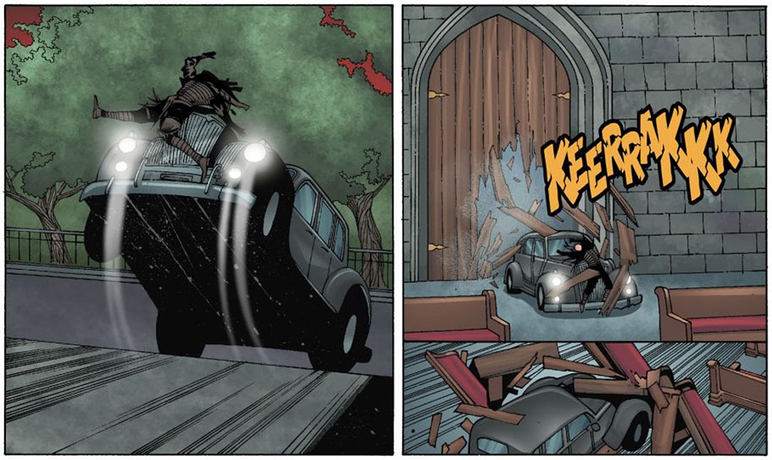
Upstream I've lamented the strange computer-rendering of a house or a car in Animal Man, how utterly incompatible they seemed to the very expressive linework, but here I love these contradictions. Pictorial space seems digitally collaged together, it's structured in askew layers which despite the steep foreshortening make no sense at all, which funnily seems to give it a sort of old-school quality. Movements are frozen or expressed by lines which would usually define surface. See this panel with the car an absolutely solid, unmovable object yanked from a standstill to a rampant posture by the glare of its headlights, while the concrete surface we stand upon comes crashing toward us like a waterfall. Similarly, on the lower right, the floor is pulling itself from under the pews ...


The story? I don't know, pleasant enough. Probably some cheesecake would have served it better. The jokes merely disrupt the mood and, though the issue is mostly composed of action and bonding rituals between the women, there hovers an air of indecision about them, of pauses that correspond to the empty digital spaces. Here's an interesting panel after the deed, the composition centering on the lid of the freight car that has just been closed to contain the threat, while the heroines linger each alone with their blues, two with even their heads cut off by the image frame.


So while I don't suppose it's a good comic by any proper standards, I'm really looking forward to how the series will continue ...


Friday, March 30, 2012

Superhero Spring Round-Up 2012


I am sorry but I may have inadvertently jinxed Animal Man (DC). They were still doing okay when several posts upstream I suddenly started to doubt the series because it seemed to display a lack of interest in its title character, and since then writer Lemire has only been stalling and artist Foreman has been mostly in hiding. Issue 6 read like Lemire, unfulfilled by the half dozen titles he is currently writing, was pitching a slacker superhero comic to Fantagraphics. He had no real idea for it yet except that the former superhero would be boring and depressing with a thoroughness that ticks all the obvious boxes: alcohol, divorce, a kid that just wants to love his dead if only the old guy weren’t so pathetic. Which invites unhappy comparisons to Grant Morrison’s classic run on the character, where we had the last appearance of a former would-be super-crook in “The Death of the Red Mask.” Which was pretty depressing also and ended in a suicide, but it took super-heroics (and writing about them) as the actual topic. Whereas Lemire gives us run of the midlife crisis.

The comparisons with classic Morrison become even unhappier in the latest issue, where Buddy and Cliff take a walk so they can bond and they bond over the fact of the awesomeness of Buddy being Animal Man. Which is about the first time he appears as Animal Man since the first issue, here to impress a couple of girls for his son. Just see how awed the girls are. I mean, wow, superheroes. It makes me long back to Morrison’s “Home Improvements,” where the Martian Manhunter took over impressing duties, frightening Cliff’s schoolmates to stop them from picking on him, and everything was a little more ambiguous, funny, and true. In fact Lemire used to be quite good on family in the early issues of his run.


But it’s really strange, sometimes it is like the comic itself had amnesia, the way that Buddy forgets what it is that is coming after them, and the way he needs a dream to enter worlds that before seemed like pretty much everyday rot reality?

And does Travel Foreman actually have better things to do or is he getting ousted the complicated way, because he has fans out here?


The other comic I had previously jinxed was of course Daredevil (Marvel). After two abysmal issues there has been a slight return to form, though Daredevil hasn’t quite recovered from the Spidey mash-up and therefore calls himself “hero to the judgment-impaired everywhere” among other self-deprecatory jokey stuff. Also, the storyline has the new, fun Daredevil plunging the bowels of the earth to retrieve the body of his dead father from all sorts of yucky creatures, only to find that he just doesn’t care anymore.

Art by the Riveras still is beautiful, especially the page layouts are great. But where in Daredevil one usually derives some pleasure from ingenious or playful ways to visualize his radar sense, they have now established the convention that Matt sees like we do only sort of in pink contour line drawings on a black ground. To the last detail. In one panel of the latest issue, there is even a break in perspective where we see Daredevil as a pink outline falling through a chute drawn as a contour map. My guess? They just don’t care anymore.


I’m still following Supergirl (DC) with distrustful delight. I fear I have to start giving the writers credit, because they’re keeping the pace marvelously (and I wasn’t exactly keen on how the so-called worldkillers looked in recent issues, these creatures weren’t designed by evolution, that’s for sure). The comic really builds: all the fights following from her natural impulse to just hit into something with grim determination for the lack of knowing what’s happening exactly. I especially like that so far there has been no out and out antagonist wanting to kill her. First her cousin, then that dealer in outer space flotsam who wanted to use her, now a worldkiller as a sort of bossy potential sister figure . . . values kept in clear boundaries only by the healthy workout of a fight. Or one could read this as a different take on fighting as means of communication in superhero comics, where usually opponents will keep up more or less witty small talk during the fights, which stays pretty meaningless, while the fists engage with each other and propel the narrative. This learning to get to know the world (and yourself, even in death) through your fists is explored with unprecedented care and detail here:


To make this a proper round-up: a quick shout-out to Milligan’s run on Hellblazer (Vertigo). It’s the only real run on a character in comics there is right now? I wonder how Milligan does it, since he also is churning out three or four titles a month, all the others complete and utter dreck? I do not really judge single issues anymore, I just greet them as friends (in need of some help before they go to hell), as long as they give me that dark eye-sockets crumbling from habitual dread-like stare Camuncoli and Landini are so great at. Also this:


I haven’t been able to get into the first issues of Brubaker and Phillips’ Fatale, they seem such a staid team by now, maybe they should try making a graphic novel out of De Lillo’s Underworld or something. But Winter Soldier (Marvel), Brubakers other new title with one Butch Guice on the pencil, has me hooked so far (yes, you need to get beyond unforgivable title pages). I usually wouldn’t much like art that looks like photo collages pushed through a digital faulty xerox plug-in, with all hand-drawn parts in complete ignorance of anatomical or physical logic, but they do that so very well. Also, the story, at least as long as I can’t quite follow it (I try to prolong that state by only skimming over the text), proves the healthiness of the motto for Brubaker/Phillips’ earlier Incognito: “The secret ingredient is pulp!” In this case an 800 pound gorilla blasting away on his 50 caliber machine gun:


If you want more great page layouts, the wonderful Javier Pulido has now been on The Shade (DC) for two issues. Although he can’t really help the thing. And Saucer Country (Vertigo) might prove worth following.

Tuesday, March 20, 2012


I’ve been reading City of Glass, the cartoonization of the Paul Auster novel by Paul Karasik and David Mazzucchelli. I hated it before it even began, since unfortunately, against my usual custom, I read the foreword, by one Art Spiegelman, editor of the book. He recounted his choice of an artist: “I enlisted David Mazzucchelli, whose art on Frank Miller’s Batman: Year One had shown a grace, economy, and understanding of the form that made the superhero genre almost interesting.” Oh yeah like it takes your breed of anthropomorphic mice to make the holocaust almost interesting again. I threw the book into a corner and read some Supergirl instead.


When I took the book up once more, I became really excited about it on page 15, the panels you see above. This is Peter Stillman talking, the face of the mystery (happily I won’t have to go into the story for this, so no spoilers ahead except ultimate disappointment). Or rather, this is his speech bubble talking through him. It’s such a simple but brilliant move. The man becomes a puppet of his own voice. 


Then a slow zoom and we move past the uvula into allegorical realms where there are all kinds of things that the voice is speaking through, like cave paintings, drains, gramophone horns, turds, teddy bears, all defining the character as his attributes . . . but more than that the speech bubble’s tube down the throat of things channels the author speaking, first of the comic, but on a deeper level of the original novel, Paul Auster, whose puppets Karasik and Mazzucchelli are (and who in fact has a cameo in the comic/novel itself, wrapping this up structurally). And by acknowledging that all the images are read/read out by that auctorial voice, the art fights back and you have a real back and forth between words and image that in this richness is a very rare thing.


But they can’t keep it up.


Here’s the upper two tiers from page 100. “Quinn spent the following day on his feet.” And you get feet. For “every twenty minutes he would call Virginia” you get a clock. “The busy signal had become a comforting metronome,” that was actually two panels earlier, bzzt bzzt. “The random noises of the city” . . . are cars in the city that random? but yeah, they help us understand the word “noise.” Mind-numbingly literal. “Negating speech and the possibility of speech,” and you get the graffiti on the wall behind . . . that’s actually a subtle gesture I’d have enjoyed earlier in the book. Still, it has become obvious that the art has no life of its own left but merely illustrates the narrator’s voiceless text boxes.

Which is a clever demonstration of why adaptations usually suck.

Tuesday, February 14, 2012


One more quick convergence, because really I have the feeling that I'm unto something. Above is the Metal Master from issue 6 of the original Hulk wielding his powers, art by Steve Ditko. This is how the Master himself explains his artistic process in an earlier panel: "On the planet Astra, our sculptors make magnificent statues of metal, forming them, shaping them, by their mental commands alone!"

Should you now wonder what became of this pretty awesome work, as clearly you should (did it really dwindle away into--gasp--nothing? despite the fact it just seems to take on a life of its own), here's On the Hook from 2006, a steel sculpture by Berlin artist Alexej Meschtschanow, who as far as I know works in a similar way. It's too obvious for words, really. The sculpture is even cut off where the panel ends ...

Tuesday, January 17, 2012


Once you see it, it’s so obvious. Whoever drew this panel from the May 1942 issue of Blue Bolt must have been heavily into Swiss artist FĂ©lix Vallotton, member of the Nabis, who had painted The Punished Crime (see how even the title fits!) in 1915, as the centerpiece of a triptych. Well, I just casually drop this fact to establish that you can trust me on stuff like this because ...

... let me now introduce you to German painter KRH Sonderborg, a post-war artist who is usually grouped under the label Informel—that’s roughly the European counterpart of abstract expressionism. (If you’re interested, there’s a good interview with the artist online here.) Some of his work looks very much like he had an affinity with comics, porous black silhouettes of building cranes or powerlines deviding the white, painted with a quick decisiveness that gives a psychological edge to the objects. Maybe best known of those is a portrait of an electric chair that fills the complete frame, with a curious eye for the way its parts have been assembled and screwed together, like a human perspective against Warhol’s oppressive silkscreen of the same object. Sonderborg’s most easily recognizable signature style, though, is painted in black and white diagonal splatter with just a dash of red added, spray drops of paint from the impact of color on canvas dripped along the lines of the action, accumulating into untidy power centers and sometimes repetitive forms like parts of machinery. And if you are a comic artist and stare at this long enough you will start drawing panels that look like this:


How serious am I? It’s difficult, because who knows, it might all be coincidence. But contrary to the single panel in Blue Bolt, which seems to reference the one painting and then everything goes its own sweet way, when I started reading Miller’s Holy Terror, I saw the shadow of the spirit of Sonderborg, at least for the first 50 pages or so. It did not make me think of a certain painting (though once I strated searching I immediately found one that was compositionally very close to a panel), instead for a moment it seemed again so obvious that Miller was heavily into the earlier painter. In my delight, I almost didn’t notice his book was challenged in its morals :-)(I might actually write it up at some later date, it’s a pretty impressive comic in many respects).


Oh and: Peace.