Monday, October 10, 2011

Weekly Comics: October 5, 2011


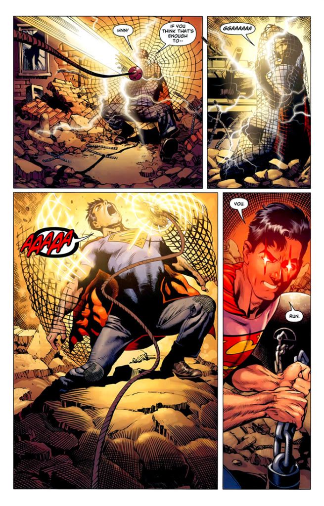
Action Comics #2 (DC) - Grant Morrison's badass new take on Superman continues to be a ton of fun and defy expectations. In this case, the second issue opens with Superman in the custody of Lex Luthor and the US military, strapped to an electric chair and being subjected to probes and tests. Nobody knows his limits, and they're pushing his endurance, trying to figure out what hurts him. But Morrison doesn't let Superman remain defenseless for very long, so the second half of the issue is thrilling and grin-inducing, as Superman busts free of his fetters and begins tearing shit up. Morrison's having fun writing a Superman who's having fun with his powers, a young and angry Supes who at one point playfully twirls around, sending out an arc of heat vision to melt the guns of the soldiers pursuing him. Superman's escape sequence is perfectly staged by Morrison, with delightfully posed panels like the one where he calmly strides up a staircase with soldiers amassed above and below him. He strolls through the base as though he's just taking a walk, confident in the knowledge that these men can't really hurt him, simply enjoying breaking holes in walls, letting bullets bounce harmlessly off his chest and smashing any soldiers who try to stop him. When Luthor shows Superman a decaying alien goat-like creature, claiming that this is Superman's true form, Superman simply laughs, then calmly announces that the tests are over, initiating the rollicking mayhem of the book's second half. Regular artist Rags Morales is here assisted by Brent Anderson, an ominous sign that DC's pressure to keep books on time is already affecting the artists, and the art is pretty inconsistent with a few particularly awkward panels in which Lois Lane's appearance fluctuates wildly. Nevertheless, Morrison easily keeps up the energy and edge and enthusiasm of Action Comics #1, and his snotty, hot-tempered Superman continues to be a joy to watch.

Animal Man #2 (DC) - Somehow, Jeff Lemire and Travel Foreman have managed to top their stellar first issue with an even better second one, which revels in the possibilities of mingled dark humor and grisly horror offered up by this story. This issue is packed with disturbing images, but each new creepy visual is imbued with a sense of discovery and delight that makes this a dazzling, fun read in spite of its dark content. By the fourth page, when Foreman packs a kitchen scene with wonderful little details — Maxine trying to feed milk to a thirsty skeletal Mrs. Pickles, Cliff gleefully using his cell phone to record dead animals doing battle on a garbage can, and then casually heading out the door with a shovel to dig up some more nasty fun — the comic has acquired a hurtling, manic forward momentum where each page seems to top the last in nutty imagination. Foreman's art is, if anything, even better than in the first issue, as he fully embraces the strangeness and reality-warping nature of the crisis in "the Red" that's propelling Buddy and his daughter into danger. His control of facial expressions is virtuosic, ranging from the cartoony pouting of Max to the devastating panels showing Ellen's tearful, confused, angry response to the weirdness tearing her family apart. This is shaping up to be the work of true mad genius promised by Lemire and Foreman's first issue, with no signs of letting up in intensity or inspiration.

The Boys #59 (Dynamite) - This issue does not start promisingly, what with the cliffhanger from last issue — a tense showdown between the Boys and the Seven — almost immediately fizzling out. Things don't get better in the pages packed with verbose word balloons as Hughie spills his resentment of Butcher, which is starting to seem like a broken record in recent issues. But then the Boys return home to find that Butcher's beloved dog has been killed by one of the Seven's superheroes, and Garth Ennis again displays the weird mix of poignancy and brutality that makes his best comics (in which company The Boys, admittedly, usually does not belong) simultaneously so hard to take but so hard to look away from. Because there's something weirdly touching about the psychopathic Female lying down next to the dead dog, mimicking the animal's limp form and closed eyes as Butcher darkly stalks off to do what he needs to. So although the issue started as an anticlimax, by the grisly end it's obvious that the expected war is coming anyway. The final pages, with one line of dialogue repeated like a mantra over and over, are especially effective in that typical ugly Ennis way, with emotions of loss and sadness transmuted into violence and horror.

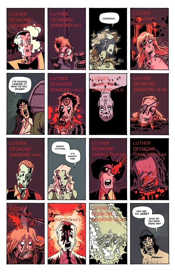
Casanova: Avaritia #2 (Icon) - With this newest Casanova miniseries, Matt Fraction is really digging deeper than ever into the heart and soul of his pandimensional spy thriller. He's using the pop culture riffing and anything-can-happen anti-logic of Casanova to explore some pretty heavy themes. It's all about patterns and repetition — specifically, about escaping from the patterns that threaten to lock Casanova Quinn into a potentially never-ending cycle of destruction and guilt. At the climax of the comic, during a bloody but beautifully visualized action sequence, Fraction replaces the dialogue with placeholders, indicators of the kind of formulaic dialogue that should go here, at this place in the story. And it's just the set-up because when Casanova begins speaking with his own words again, his voice no longer a simple vehicle for action movie clichés, he finally breaks free of the cycle, offers up an alternative to the familiar pattern. It's about free will, man! And it's damn good stuff. Gabriel Bá, more than ever, is drawing Casanova and his future nemesis Newman Xeno — who Casanova must kill, over and over, in one universe after another — as Mick Jagger and David Bowie, locked into a cycle of homoerotic attraction and deadly rivalry. Bá's art is wonderful and trippy, making it seem as though Casanova is living an acid trip, whether he's in "reality" or dreams or skating through interdimensional space, and it's appropriate that in the final sequence one important "version" of Xeno isn't quite sure if he's just really high or if he's actually talking to his would-be assassin.

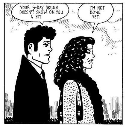
I was also tickled that, in the typically rambling essay in the back of the issue, Fraction talks about crying while reading Jaime Hernandez's "The Love Bunglers." Right on.

Detective Comics #2 (DC) - The first issue of writer/artist Tony Daniel's Batman serial didn't make much of an impact other than its over-the-top final page, which showed the Joker's face sheered off and pinned to a wall. The rest of the issue was all gritty voiceover and Dark Knight clichés, but I figured I'd give Daniel a second issue to see where he was going with this. Unfortunately, this issue dives headfirst into the blunt, stupid nonsense lurking in the subtext of that first installment, and now I'm done. It's a really goofy comic, although it wants to be anything but: it's the product of someone trying way too hard to create something "dark" and violent, and instead producing unpleasant camp. The issue starts with a weirdly homoerotic scene in which Bruce Wayne is courted by a muscular businessman who strips off his shirt and climbs a rock wall with Bruce while talking business. Then, as if to prove Bruce's hetero bona fides, there's an awkward attempt at a seduction scene with a generic Wayne bimbo, and then things get really goofy. By the time a villainess shows up dressed like she bought a "sexy nurse" outfit at a Halloween costume shop, baring cleavage and wielding a hammer, there's really no redeeming this one.

iZombie #18 (Vertigo) - Since Mike Allred's iconic art is generally the main appeal of iZombie, it's surprising that guest artist Jay Stephens contributes to one of the series' best issues. Stephens has a wonderfully cartoony clear-line style, and Laura Allred's colors here also tend even more towards bold primary colors than usual. The style recalls Tintin and Dick Briefer's Frankenstein, and Chris Roberson's story also evokes the globe-trotting adventures of Hergé or Terry and the Pirates. It's old-school, and enjoyably so, in a very different way from the Universal monster movie retro affection that runs through the rest of the series. Curiously, I'm also reminded of the campy, cartoony climax of the recent American Vampire #19, drawn by Jordi Bernet. I didn't expect much without Mike Allred around (he only provides inks on a few pages) but Stephens, who seems to be mostly involved in animation and kids' comics, really impressed me.

OMAC #2 (DC) - The second issue of Dan Didio and Keith Giffen's manic Jack Kirby pastiche isn't quite as much goofy fun as the first one, but it still offers up plenty of Kirbyesque pleasures. The hapless hero, who as OMAC rampaged throughout the first issue, now reverts to human form and has a frazzled dialogue with the nigh-omniscent satellite Brother Eye, communicating through cell phones and TVs and any other handy electronics. There's something endearing about Brother Eye's motherly, solicitous conversations with Kevin, looking out for the young man's nutrition while maneuvering him into place to battle another super-powered being. It's a good mix of brisk action and light-hearted humor, a very old-school book with a tone to match Giffen's Kirby-aping artwork. This is just big dumb fun.

Severed #3 (Image) - This comic is still all about slow burn buildup rather than all-out horror, but it remains an effective tactic. In this issue, writers Scott Snyder and Scott Tuft have young Jack and Sam finally come face to face with the chilling human (?) monster who's skulked through the shadows of the previous two issues, the man with the filed, hungry teeth hidden behind a false set of normal chompers. There's no gore here, no violence, only a conversation between this predator and his latest targets in which every word subtly and not so subtly teases the absolute horror still to come. At one point, the old man asks the two children, "what's in the future for you?" and framed in the foreground between his outstretched hands is a plate full of picked-clean duck bones and uneaten skin. It's an image freighted with sinister meaning, and artist Attila Futaki continues to give everything in this story weight and hyper-real lushness that adds to the creepy vibe drifting through these pages. Shadows have real depth and the sky is a constant swirl of bright colors giving way to the midnight blue darkness of night. This is a sublimely creepy horror comic, the kind of story best told huddled around a campfire in the dark or curled up in bed with a flashlight. Best of all is the moment when the cannibalistic killer describes exactly what he's going to do to his victims, without them realizing: "he'd feed the duck beer, massage its wings, grant it its every wish... meat is muscles, boys, and muscles remember... everything. Especially the last days. If you're gonna eat an animal, make sure its last days are memorable."

Stormwatch #2 (DC) - This comic continues to be better in terms of crazy plotting and cosmic visual extravagance than in actual writing, but maybe that's okay. It's a wildly entertaining comic, moving at a frenetic pace and leaping from the literal beginning of time to the interior of the moon to Stormwatch's space station HQ to various locales around Earth. It's big and bold and aggressive, and that translates to the dialogue as well. Paul Cornell seems to think he's cleverer than he actually is, and stuff like Adam One's meta joke on the second page just comes off as clumsy and nonsensical. The dialogue is wordy and full of exposition, and there's something really unnatural about nearly every sentence. Every conflict or motivation is bolded and underlined, particularly the struggle over leadership of Stormwatch that runs all through this issue. The dialogue is also still compromised by the necessity of continually introducing characters and describing their powers. Still, Cornell's nutty concepts — lovingly, colorfully realized by Miguel Sepulveda and the rest of the art team — more than make up for the exposition-speak that seems to afflict every character. There's also a genuinely great running gag about how the team's media manipulator convinces the rest of the world's heroes that the chaos on the moon is being caused by low-rent villain the Fox. There are still plenty of seams showing in Cornell's construction, but if every issue is as much fast-moving fun as this, it'll be easy to ignore the problems even if the writing doesn't improve.

Swamp Thing #2 (DC) - It's a little disappointing that Scott Snyder is still leaning heavily on exposition and backstory in his second issue of Swamp Thing. The first issue was an intriguing set-up that teased some really eerie horror to come with a few stunning sequences of odd occurrences happening around the US. Instead of leaping deeper into that territory here, Snyder slows things down for a long infodump where the current Swamp Thing relates a whole lot of history and prophecy to Alec Holland, trying to convince Holland to take on the mantle of Swamp Thing. It's interesting exposition, at least, and Yanick Paquette's layouts — reminiscent at time of JH Williams III — help to jazz up these pages with gorgeous, sprawling guided tours through the concepts that Swamp Thing is talking about. The second half of the issue is then given over to a crisply executed action sequence, although the shock of the new has already worn off with the twisted-head zombies who attack Holland here, and his last-minute rescue by Abby Arcane borders on cheesy. This series still shows a whole lot of promise, and it's still beautiful, but it needs to start moving at a faster pace. If the next issue opens with Abby delivering her own lengthy infodump to Alec, I would not be the least bit surprised, but Snyder will be squandering the potential of a book that promises to be one of the best of the New 52. I did like the shout-outs to former Swamp Thing artists Stephen Bissette and John Totleben embedded in the artwork.

Sweet Tooth #26 (Vertigo) - Jeff Lemire's post-apocalyptic road movie adventure about a boy with antlers is starting a new arc this issue. Issue #25 left off with much of the cast preparing for a trip to Alaska, where they hope to discover the answers to mysteries like the plague that wiped out much of the world population and the animal/human hybrid children who might be connected to the disease in some way. This new arc, though set in Alaska, leaps back in time to 1911 to tell a story that's obviously going to lay some groundwork for the eventual journey of Gus and his friends to the icebound north. Lemire takes a break from the art chores as well, and his friend Matt Kindt lends a distinctive, sketchy but lush watercolor style to this issue's tale of an ill-fated Alaskan expedition. It's a gorgeous book, especially when the expedition reaches Alaska and three men wander off into an icy wasteland rendered with stripes and washes of pale grays and reds sweeping by in the background. It's an abstracted vision of the icy north that increases the sense of dread hanging over the three men. Kindt also achieves some very striking effects, as in the panel where a dog pokes its head up through the wispy, multi-colored strands of the wind and blowing snow, its green eye looking melancholy, a "whimper" enclosed in a speech balloon near its head. Several pages later, the lead character is reflected as a wavery, warped outline in the glossy black eye of a dead dog, and soon after there's a panel where a wooden church's steeple is reflected in the man's eyeglasses. Such echoes and reflections define the haunting visual storytelling going on here.

The Walking Dead #89 (Image) - And Robert Kirkman's epic zombie soap opera continues. There's not much to say about an issue like this, in which not very much happens until the end, ensconsed as it is in the middle of what's shaping up to be a very long storyline about Rick and his band of survivors settling into a more stable community, trying to build a permanent place to live. I can see this storyline stretching out for a very long time, maybe until the end of the series, and I kind of hope it does. In this issue, it seems obvious that among other things Kirkman is setting things up for a more sustained look at the long-running subtext of Rick's son Carl growing harder and colder and tougher in the zombie apocalypse, deadening his emotions in response to everything he's seen and had to do. It's something that Rick hasn't addressed quite as directly as this before, and neither has Kirkman. It's also yet another issue that ends with Rick acting like a badass, and it's interesting that the ending sequence with its series of weapon-wielding portraits of Rick and his friends more or less confirms the fear of the would-be rebels that their community is pretty much being taken over by force. I wonder if Kirkman is going to address that in subsequent issues. He's certainly never shied away from making Rick, the paranoiac control freak, a fairly unsympathetic character, and the antagonists in this plot are definitely not entirely in the wrong.

Wednesday, October 5, 2011

DC's New 52: Final Thoughts


Now that the first month of DC's New 52 reboot is over, it's time to evaluate the overall scope of this project and how successful it has been. The New 52 was expressly intended to bring DC comics to new readers, and since in many ways I'm one of those — a longtime comic reader who has never been too interested in DC beyond a few titles — the initiative was at least successful in generating some interest for me (and I suspect a lot of other people like me). There are a few titles in particular from this reboot that I absolutely loved, and a bunch more that I liked well enough to read for the immediate future. Even if I eventually wind up trimming everything but the titles I like the most, I'll be reading something like 10-15 DC titles on a monthly basis as long as they keep their current creative teams and level of quality. Since before this I was basically only reading Grant Morrison and Scott Snyder's takes on Batman, and J.H. Williams' Batwoman (which would have continued in more or less its current form with or without the reboot), DC has certainly succeeded in getting me interested in their wider line.

I won't speculate beyond that for how this relaunch has done for DC commercially, although it certainly seems that they've made their desired impact in that respect, with almost all 52 titles selling out and many of them going to multiple printings to satisfy demand. That's a good sign because I want the books I love to continue, and so far it seems like most of the best titles will be pretty stable for the forseeable future.

That said, DC has obviously hedged their bets here by introducing the relaunch with the Flashpoint miniseries (which I haven't read, though I know the gist of what happened) which would seem to suggest that the status quo could be reset yet again at any point. That impression is heightened by the fact that every #1 issue from the first month contained an Easter egg of the hooded mystery woman from Flashpoint, whose presence in all these books hints that eventually DC could use another crossover to revert the universe altogether or just tweak the elements of the new universe that aren't working. I think it's a bad sign, honestly, that there are already hints of them laying the groundwork for that probably inevitable second wave of changes and reboots.

I just hope that if (when!) it comes, it doesn't interfere with what creators like Jeff Lemire, Scott Snyder, Brian Azzarello and J.H. Williams are doing in their respective books. One thing of note about many of the titles that I admire the most from this relaunch is that they seem to be doing their own thing in a private corner of the DC universe, without many readily apparent connections to other titles. Azzarello seems to be crafting his own fresh take on mythology in Wonder Woman, Lemire and Snyder have roped off a dark, horror-based territory for Animal Man and Swamp Thing to interact with one another, Batwoman remains its own self-contained thing within the larger Bat family, and Paul Cornell's Demon Knights is set in the distant past. Hopefully, these titles will retain those distinctive identities without getting folded into whatever larger crossovers and line-wide stories that DC editorial will start pushing down the line, when the New 52 doesn't seem as new anymore and the company needs some newer hook on which to hang their hype.

Below is my summary ranking of the entire New 52 first month, divided into five categories of quality. The rankings are probably self-explanatory. The great titles are the ones I love unreservedly, the good ones have some room to improve but remain very enjoyable, and the borderline titles have some interesting elements and could either become worthwhile with further issues or squander their potential. The titles in the boring and awful categories, obviously, are the ones that I definitely won't be continuing with, since one issue was enough to decide that I didn't want more of these series. A significant number of the New 52 first issues were simply mediocre and boring, with little to distinguish them, rather than outright bad. In a way, that's worse: I certainly had more fun reading the aggressively lousy Red Lanterns, Suicide Squad and Hawk and Dove than the simply boring stuff like Men of War or Birds of Prey. As bad as those bottom few books were, at least they didn't make me sleepy the way all those generic, forgettable superhero titles did.

GREAT
1. Animal Man
2. Wonder Woman
3. Batwoman
4. Demon Knights
5. Swamp Thing
6. Action Comics
7. Justice League Dark
8. The Flash

GOOD
9. Batman
10. All Star Western
11. Frankenstein
12. Green Lantern
13. Justice League
14. Catwoman
15. Superman
16. Green Lantern Corps
17. Batgirl
18. Superboy
19. Stormwatch
20. OMAC
21. The Fury of Firestorm: The Nuclear Men
22. Supergirl

BORDERLINE
23. Batman and Robin
24. Aquaman
25. Deathstroke
26. The Savage Hawkman
27. Teen Titans
28. Resurrection Man
29. Voodoo
30. Detective Comics
31. Captain Atom

BORING
32. Nightwing
33. Green Lantern: New Guardians
34. Batwing
35. Mister Terrific
36. Birds of Prey
37. Blue Beetle
38. Grifter
39. DC Universe Presents
40. Justice League International
41. Static Shock
42. Blackhawks
43. Green Arrow
44. Men of War

AWFUL
45. Suicide Squad
46. Legion Lost
47. Legion of Super-Heroes
48. Red Lanterns
49. I, Vampire
50. Red Hood and the Outlaws
51. Hawk and Dove
52. Batman: The Dark Knight

Monday, October 3, 2011

Weekly Comics: September 28, 2011


American Vampire #19 (Vertigo) - With the recent epic World War II storyline concluded, Scott Snyder's gritty vampire series takes a break with an arc dedicated to the early life of Skinner Sweet, before he became a vampire. Sweet and his future adversary Jim Book are in the army together, fighting Indians, and the bulk of this issue focuses on the brotherly rivalry between these two men who would eventually become worst enemies. Jordi Bernet is the guest artist for this arc, and his cartoony, slightly sketchy style is a good fit for this tale of a simpler time in these men's lives. This is especially true of the first few pages about Sweet and Book's boyhood, which features a bright, sunny look and big-eyed character drawings that immediately contrast against the much darker style usually brought to the series by Rafael Albuquerque. With the emphasis on Book and Sweet and the broadly telegraphed differences between them, this is a pretty atypical (and largely vampire-free) issue for much of its length. Of course, the ending marks a return to the pulpy lunacy that I've come to expect from Snyder's Western vampire saga, when a curvy, naked vampiress makes an appearance in the last few pages. At that point, Bernet's bold art gives the scene a splashy, campy tone that suggests that some good goofy fun is ahead for this story.

Brilliant #1 (Icon) - This is the first issue of a new creator-owned series by Brian Michael Bendis and artist Mark Bagley, which has apparently been a long-gestating idea that Bendis has been waiting to do with Bagley. The first issue is... okay. After loving a lot of Bendis' work for years, especially Alias, I've gotten burned out on his style since he started steering Marvel's Avengers and a lot of the company's big superhero crossovers. This issue does little to alleviate my exhaustion with him, because the trademark wordy, hyperactive, pattery Bendis dialogue is all over the place, with chains of word balloon exchanges winding through most of the panels. His stylized dialogue has always walked a thin line between amusing and annoying, and here it jumps back and forth between the two poles, with an unfortunate emphasis on the latter. I'm not sold on the idea (a bunch of prodigy Ivy League college kids "invent" superpowers) or the characters, and so far it basically feels like Heroes, dealing with the concept of superpowers in a mostly realistic world with young people who don't don costumes when they get their new abilities. I'm curious enough to check out some more of it, but so far it doesn't seem like Bendis has returned to the heights of Alias or Daredevil or the best parts of the sometimes-uneven Powers.

FF #9 (Marvel) - Jonathan Hickman has been doing excellent work on Fantastic Four and its successor series FF ever since his debut on the former series. The reverberations of his fantastic first arc, in which Reed Richards tried to "solve everything" with the help of a pandimensional assembly of his parallel selves, are still being felt in FF, as four dimensionally stranded Reeds stand at the center of a massive war that Hickman's been patiently setting up for some time now. This issue takes place at the climax of this war, so it's mostly all dedicated to battle and action, with visceral art and layouts by Steve Epting that make all the explosions and fist-fights pop off the page. As usual, though, Hickman is at his best when he cuts away from the action for a few pages spent with young Valeria Richards and would-be child supervillain Bentley. Hickman's expansion of the Fantastic Four cast to focus on the Richards kids and a host of other children and oddball characters is the best aspect of his run, and his dialogue for these characters — precocious but definitively childlike — is pitch-perfect. This is a short, delightful little scene, a much-needed break from the otherwise non-stop action on display here. One hopes that Hickman's FF will eventually focus even more on the Future Foundation class and other supporting characters — maybe once the main Fantastic Four series returns, also with Hickman writing, in November.

Journey Into Mystery #628 (Marvel) - I've been reading this series ever since it split off from Matt Fraction's Thor as a showcase for the young, newly resurrected Loki, and I'm not sure why. Part of it is that I love the character: Loki as a kid is just a lot of fun and his constant machinations are really charming, whether they're here or over in Fraction's Mighty Thor. The problem is that this series has been mired in the Fear Itself crossover (which I'm not reading) since it began, and a lot of these issues just read like summaries of things happening elsewhere or bits of ancillary action at the fringes of the story. Also, Kieron Gillen's wordy, text-box-heavy style is doubtless intended to give the impression of a series steeped in old world myths, but the effect is mostly just stilted and arch. This issue features nice art by Whilce Portacio, who's a little more lively than Dougie Braithwaite, whose art on previous issues of Gillen's run has always seemed overly stiff and static, not to mentioned smothered under oppressive coloring. There continue to be flashes of cleverness and fun here whenever Gillen abandons the endless narration boxes to let Loki crack wise, but he still doesn't nearly have Fraction's subtle wit or sense of scale. I'm hoping this series will be able to stand on its own well once Fear Itself finally ends, though.

The Mighty Thor #6 (Marvel) - What I love about Matt Fraction's take on Thor is that it's totally unpredictable, working at a grand epic scale, dealing with myth and belief and fate and choice, as befits a character right out of mythology. This issue concludes the war between Galactus and the inhabitants of Asgard that has run through the first six issues of Fraction's Mighty Thor. And suffice it to say that the war has been resolved in an utterly unexpected way, tying together the large-scale cosmic conflict with the ground-level struggle between the Asgardians and the humans living in a town near Asgard's current earthly location. Most notably, the local Christian pastor who had often been a subject of comic relief in earlier issues unexpectedly gets treated in a much deeper and more complex way here, and the resolution of that plot sets up a strange new status quo that should make the next arc of this series just as interesting. As usual, Olivier Coipel's art is stunning, particularly in the panels of a brooding, shadowy Galactus looming over the tiny figures of the men and gods arrayed at the feet of the world devouring being. Also as usual, much of the action is splayed across the elaborate double-page spreads that Fraction favors for his work with Marvel's Norse characters, contributing to the sense of scope that's so important to dealing with gods and aliens and creatures that dwarf mountains.

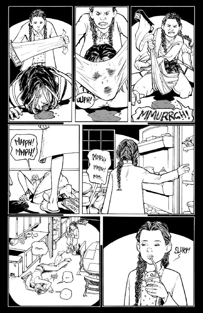
Rachel Rising #2 (Abstract Studio) - This is the second issue of a new series written and drawn by Terry Moore, of Strangers In Paradise fame. While I never liked Moore's most famous series, his clever, light sci-fi follow-up Echo was remarkable, and this new horror project promises to be equally compelling. Moore and genre fiction seems to be a really good fit. In the first issue, a young woman named Rachel woke up in a shallow grave in the woods, seemingly brought back to life with only vague memories of a shadowy figure strangling her with a length of rope. This issue is mostly about Rachel's visit to her mannish coroner aunt, who, curiously enough, takes Rachel's presence as a hallucination of sorts, reacting very strangely to her niece. These scenes have an odd rhythm, as though something is subtly off, disconnecting the reincarnated Rachel from her former life.

Moore's drawing is as beautiful as ever; his line is graceful but just a little ragged, and he makes liberal use of white space so that the overall effect is spare and ethereal. He's a sublime draftsman, and he especially has an affinity for capturing the nuances of facial expressions and body language. In one wonderful two-panel sequence, a young woman comes home from a date, her face flushed, a distant, contented smile on her lips, and in the next panel her expression falls and her body language becomes antagonistic and coiled as she sees her sister, who has been spying on her. It's slightly cartoony, and Moore doesn't flinch from manga-esque exaggeration and cartoon devices like big dramatic sound effect lettering. He blends these cartoony flourishes with whimsical dialogue and contrasts the tonally lighter moments against the darkness and violence that forms the core of the book. To that end, the issue ends with a harrowing, brilliantly rendered sequence that suggests that the series' horror component is going to remain prominent (and very satisfying).

Thursday, September 29, 2011

DC's New 52, Week 4 (September 28, 2011)


This is the final week of DC's New 52 initiative. As with the other weeks, it's a bit of a grab bag. There are no books here as strong as the best titles from previous weeks, but there's still some good stuff, a few surprises (I never expected Firestorm to be any good) and some stuff that I'm not sure why it's even being published.

1. Justice League Dark #1 - Now this is the kind of comic Peter Milligan is meant to be writing. Despite the title, this series is DC's attempt to fold a whole bunch of its Vertigo magical/supernatural characters into the mainstream DC universe, with a catch-all title dedicated to what's bound to be a pretty loose grouping of unconventional heroes. This is Milligan's forte, and that's immediately obvious as he spits out page after page of crazy reality-warping concepts and purplish prose. It reads like a pastiche of some of Milligan's peak work — particularly Shade the Changing Man, the title character of which is one of the main heroes here, and his short stint on Animal Man — but that's OK when he's coming up with something this entertaining and strange. Identical women hurl themselves into bloody traffic accidents, cows given birth to machinery, and a storm of razor sharp teeth slice Superman to bits while he muses that the teeth smell insane, which in turns prompts a narration box to counter, "but what is the smell of sanity?" The inclusion of the Justice League deliberately makes another old favorite Milligan point, that sometimes the world is just too strange to be understood or confronted by solid, noble heroes like Superman and Wonder Woman — sometimes the most damaged, wacky people are precisely the ones who can best cope with the world's lunatic shifts. The comic moves at a frantic pace and avoids the exposition trap by interspersing the obligatory character introductions with all the insane goings-on caused by the Enchantress. Mikel Janin's art is excellent, particularly in the epic sequence where the Justice League attempts to face the Enchantress. There's also a sly sense of humor here that manifests itself in things like Superman sensing that Cyborg is anxious by monitoring his oil levels.

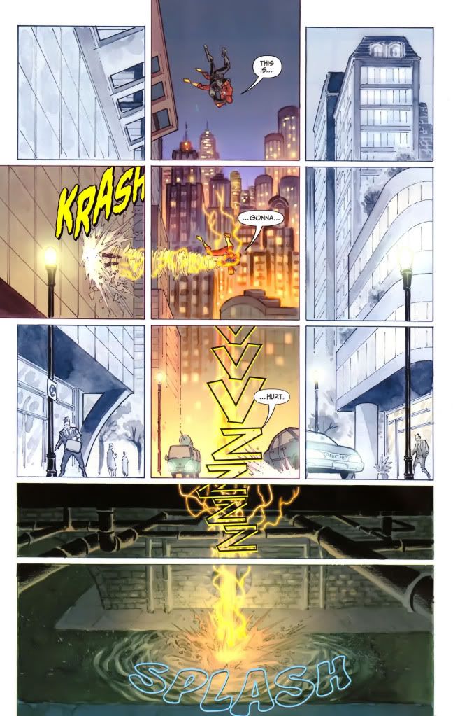
2. The Flash #1 - This is just a joyous, spirited superhero comic, as quick on its feet as the Flash himself. Writer/artist Francis Manapul (who gets some writing help from colorist Brian Buccellato) has delivered an energetic and fun first issue that gets everything just right as far as straightforward superhero antics go. Manapul's art is crisp and clean, with some inventive page layouts that communicate the constant sense of rapid motion that constitutes the heart of Barry Allen's power. Best of all is the page where the Flash, falling from a plane full of bad guys, tumbles down a series of panels in the center of the page, with the rest of the city rendered in the grid around him, so that the page as a whole looks like a segmented diagram of the city, with Barry's freefall ending below the street in the sewer that sprawls across the bottom of the page. It's all bright and beautifully colored, moving at a brisk pace without sacrificing the necessary character beats that establish the hero as an earnest, deliberate, serious young man in contrast to his hyper-kinetic powers. The pace is frantic enough and the art gorgeous enough that the initially generic-seeming villains aren't too much of a concern, and the issue ends with a series of quirky twists that suggests that even those stock, faceless baddies are pointing towards a much more interesting sci-fi plot ahead.

3. All Star Western #1 - It's great to see DC stretching into the past of its universe with this book, which focuses on Jonah Hex and Amadeus Arkham trying to solve a series of murders that are reminiscent of Jack the Ripper. This issue is especially fascinating in relation to Grant Morrison's travels into the history of Gotham City in The Return of Bruce Wayne and the rest of his Batman epic, and there are some obvious connections here in the characters of Hex, Arkham, the Wayne ancestors, and a secret society of wealthy Gothamites with some sinister secrets. More importantly, this is very well-done. It's wordy but well-written by Jimmy Palmiotti and Justin Gray, and Arkham's narration, with its attempts at analyzing his reluctant partner Hex, is engrossing and fits perfectly with the period setting. And then there's the art by Moritat, whose bold, thick lines often make each page look like gritty stained glass compositions.

4. Superman #1 - While Grant Morrison's Action Comics chronicles the early years of Superman's career as a feisty urban crusader, the hero's name title (written by George Perez and drawn by Jesus Merino) takes place in the present day of the new DC universe. This is an older, more established Superman, who still shows signs of the moralist hero of the common people established in Morrison's title, but without the same fiery anger and playful sensibility. The result is a solid superhero yarn that lacks the leaping, bounding excitement of Action Comics #1 but nevertheless seems to be setting up a fine superhero saga. The bulk of the issue concerns the first day of a new Daily Planet that's been taken over by a rival that the muckraking Clark Kent sees as a lousy gossip factory. As the merger goes into effect and Lois Lane takes charge of the new enterprise, Superman does battle with a mysterious alien fire monster. The action is fairly rote, and there's a random connection to Stormwatch #1 that suggests an eventual crossover but doesn't do much else. Still, it's interesting to see a Superman who seems so remote and lonely, and in that respect the last page, on which a dejected Clark slumps into an elevator while using his super-hearing to listen in on Lois chatting with her boyfriend, is especially effective and affecting.

5. The Fury of Firestorm: The Nuclear Men #1 - This is a weird one, and one where I didn't really know what to expect beforehand. Co-written by Ethan van Sciver and Gail Simone, and drawn by Yildray Cinar, it turns out to be an unlikely combination of high school melodrama, violent mercenary action, and explosive sci-fi craziness. Surprisingly, it winds up being a pretty entertaining issue that sets up a rivalry between two high school students: one black, one white; one a jock, the other a reporter for the school paper. The differences between these two are drawn pretty broadly, especially in the rather heavy-handed dialogue about race, but in formal terms the parallel editing and alternating narration streams keep the comic interesting. Cinar's art is very nice-looking, too, with lots of heavy blacks and strongly defined lines. The book's tone alternates, for much of its length, between action and high school drama before suddenly erupting, literally, with the transformation of the two leads into the superpowered fire creatures of the title. This is a fairly strong first issue with an interesting premise.

6. Aquaman #1 - This is a very self-aware Aquaman comic that knows that the titular hero is, for most people, kind of a joke, so writer Geoff Johns inserts plenty of nods to the jokes while trying to establish his hero as a badass with no sense of humor about his reputation. It's not great, and some of the dialogue in the later half of the book, when Aquaman visits a diner, is especially forced. An interview with a pushy blogger provides an opportunity for some clumsy faux-casual exposition, and Aquaman's humorless stoicism doesn't make him a very endearing hero. Just about all he does here is silently glower while everyone he meets wisecracks about fish and mermaids. More promising is the framing story involving some creepy-looking deep-sea Creature From the Black Lagoon outcasts, who provide a horror frame for Aquaman's on-land adventures.

7. The Savage Hawkman #1 - This is written by Tony Daniel, so of course it has a gritty, wordy tough guy voiceover running all through the issue. It's a style that's pretty common in these New 52 books, actually, though Daniel seems to be the worst offender. At one point, Hawkman calls himself "bud" while looking in the mirror; it's that kind of hard-boiled or maybe just overcooked narration. And the issue opens with Carter Hall taking his Hawkman costume, burying it in the ground, and shooting it with a gun as a symbolic gesture. That said, despite Daniel's tough guy posing, this is a decent first issue, especially when a sinister — and very Venom-like — alien threat is revealed in the later pages of the book. Most of the credit has to go to artist Philip Tan, whose detailed, textured work is gorgeous whether he's portraying ordinary scenes of archeologists at work or the increasing alien weirdness of the final few pages.

8. Teen Titans #1 - Well this just whizzes by; when I got to the last page and saw that it was over I was pretty shocked because it barely felt like I'd read anything. Which is both good and bad — it's certainly not plodding like Men of War or the Legion books, but it's also pretty fluffy. It's an assembling-the-team kind of issue with Tim Drake monitoring some other superhero teens so he can get a team together before a mysterious organization can get to the kids first. There's a very Speedball-during-Civil War moment involving Kid Flash, but other than that it's mostly about Tim and Wonder Girl, with a final page that ties back into Scott Lobdell's other book, Superboy. (I guess it's just fortunate that he doesn't seem to be tying the execrable Red Hood into these two titles as well.) It's a fast-moving book with a lot of attitude, even if some of it seems more than a little misplaced (like Tim Drake blowing up his penthouse).

9. Voodoo #1 - Considering that this is pretty much exclusively known as "that series about the stripper," everyone should know what to expect here. This makes Catwoman #1 look positively demure in comparison. Ron Marz sets this whole first issue in a strip club where the title character is one of the dancers, so naturally there are plenty of women posing in lingerie or with arms draped across their chests. It's basically a whole book of cutesy cheesecake drawings by Sami Basri, whose style is undoubtedly well-suited to drawing pretty ladies in their underwear. There's not much else here, of course, and since the issue ends with a grisly bloodbath that signals where the series is headed next, it seems like the creative team wanted to get all the sexy stuff out of the way up front before leaving the strip club setting behind. At this point, you might as well as just read a bona fide softcore porn comic, since this amounts to more or less the same thing. It doesn't have the playfulness and goofy fun of Catwoman, and though Basri's art is attractive he's no Guillem March, but neither is this as hateful as Red Hood and the Outlaws #1, still the low point in DC's treatment of its female characters. This just doesn't have much to offer besides pretty pictures and recycled clichés about strippers.

10. Green Lantern: New Guardians #1 - I'll give this issue credit for trying to approach the reboot in a slightly different way than most of the other New 52 — it rushes through an origin story in a couple of pages and then tries to introduce a whole bunch of other characters and a big cosmic plot by the end — but it just doesn't work. It reads like a condensed summary of a few issues at least, especially since central character Kyle Rayner is introduced, steps outside to go to the bathroom, gets a power ring, quickly adjusts to it and is then shown cruising around as a Green Lantern saving people. There's hardly any time to pause in order to establish him as a character or show his reactions to what should be a shocking event. Tony Bedard's trying to cram way too much into one issue here, and the result is that everything rushes by without having any impact; the main character's still a cipher, let alone the swarm of multi-colored alien Lanterns who show up to fight him by the end of the issue. The art, by Tyler Kirkham, is pretty good, and especially shows an affinity for creative visualizations of the Lantern powers: upon receiving his power ring, Rayner instantly turns the alien who gives it to him into a manga-styled imp, and later constructs a group of glowing green construction workers to catch a collapsing crane. This is pretty forgettable otherwise, though.

11. Blackhawks #1 - This is one of those issues where I'm really not sure what to say. It's not bad, exactly, just boring and undistinguished. It's about a team of UN paramilitary commandos, and they have clever nicknames like the Irishman (he has red hair!) and two of them have a secret romance that they have to keep from their superiors. And I'm getting a little sleepy just thinking about it, frankly. The art by Graham Nolan and Ken Lashley is sketchy and finicky but kind of stylish at times, but overall there's just nothing too interesting here besides some rehashed Bond movie action scenes and lots of technobabble.

12. I, Vampire #1 - Some editor at DC obviously realized, a few years after the rest of the world, that vampires are pretty hot these days, and that's clearly the only reason that this is a relaunch title. Whatever. It's boring as hell, and the structure is a mess with stilted dialogue between the two lead vampires running throughout the whole thing in caption boxes. All the usual vampire clichés are present and accounted for, of course, including the tortured vampire romance angle that's all the rage with the teens. Joshua Hale Fialkov's dialogue is mostly the kind of high melodrama that's supposed to suggest, for some reason, beings who have lived a very long time, with occasional diversions into cutesy vernacular that are all the more jarring for the general self-seriousness of everything else. The last thing anybody needs is this half-assed vampire book.

13. Batman: The Dark Knight #1 - What is the point of this book? Out of the 52 titles in DC's current relaunch, there are 11 titles about Batman or characters associated with Batman, including 4 titles that actually star Batman. I get it, DC wants as much Batman on the shelves as possible, but this seems like more than overkill. Particularly since this issue is just total junk with absolutely nothing to offer, treading over very similar ground to the other Batman first issues released during this month. Things do not start promisingly since the very first line of the issue is a caption box that reads, "fear is a cannibal that feeds upon itself." All of Paul Jenkins' writing is of a similar caliber: awkwardly phrased narration and stiff dialogue. David Finch, who co-wrote the book with Jenkins in addition to drawing it, contributes equally stiff poses, including a gratuitous pinup of a generic Bruce Wayne love interest in a super-short dress, lending more fuel to the fire of those decrying DC's unfailing sexualization of female characters. More than that this is just dumb, and utterly redundant when measured against the other Batman titles coming out now. Bruce Wayne goes to a party and gives a speech about Gotham's future, then faces a mob of escaped Arkham inmates, then squares off against the final page reveal of a buffed-up Two Face worthy of Rob Liefeld. It's like Jenkins has shuffled up the contents of Scott Snyder's far superior Batman #1 and filtered out anything smart or subtle or fun. This has some of the worst writing out of the whole New 52, and it absolutely has the worst last page out of any of these comics.

Wednesday, September 28, 2011

Love and Rockets: New Stories #4


Love and Rockets: New Stories #4 (Fantagraphics) - Gilbert and Jaime Hernandez have been writing and drawing Love and Rockets for so long now that their newest work has become like the ever-growing peak of a tremendous mountain that stretches back through all previous incarnations of the series and the iconic characters that they keep returning to. New Stories is the third volume of Love and Rockets, published on a yearly schedule in a squat bookshelf-ready format meant to take advantage of the increasing shift away from magazine-format comics.

In this volume, Gilbert offers up a two-part tale, of which the first is a pulpy vampire riff in the style of his series of fake B-movie "adaptations." While seemingly a standalone story full of all the usual Gilbert tropes — big-boobed women, sex, violence, monsters and supernatural occurrences — Gilbert's second story, later in the book, follows the lead actress from this movie into her ordinary life. I can't quite tell who this character is, if she's someone from previous Love and Rockets stories or not. It's not Fritz, the star of Gilbert's other B-movie comics, so my best guess is Mark Herrara's (ex-)wife Mila, who appeared in the Fritz stories that eventually formed the collection High Soft Lisp. But quite frankly all of Gilbert's big-boobed, tiny-waisted women are starting to look the same, and his genre comics are weird and entertaining but not as substantial or enduring as the work he used to do in his prime, in the old Palomar stories and even in much of the post-Palomar work concerning Luba and her top-heavy sisters. Like most of Gilbert's B-movie comics, "King Vampire" is beautifully drawn — even considering the grotesquely proportioned main character and a similar-looking vampiress who kind of looks like Luba — but feels a bit empty and unsatisfying. Much like the kind of trashy sexploitation flicks that Gilbert is channeling here, I suppose.

Gilbert's other piece in this issue, "And Then Reality Kicks In," is another story altogether. This fifteen-page short is the kind of elliptical, emotionally charged storytelling that Gilbert does best, where all of the substance lingers unspoken between the lines, slowly accumulating force through his whimsical, charming dialogue. Indeed, this piece is all about dialogue; it's a conversation between the actress from the vampire film and a young man who was or is or could be her lover. They simply walk down the street, stop at a diner, then walk some more. And all the while they chat, talking about work and religion, exchanging sci-fi fantasies about the future, playing verbal games based on an agreement that they should try not to ask any questions of each other. The dialogue is sprightly and spirited, and crackles with the kind of strange energy that always infuses Gilbert's best work but has perhaps not been seen as frequently in recent years, at least in my opinion.

At every level this feels like a real relationship, like a real conversation, in a way that Gilbert hasn't seemed as interested in for a while now, as he's channeled his talents more into surrealism and trashy genre pastiches and self-consciously vapid stories about vapid people. This is a simple, moving story that uses the earlier vampire piece as a way to talk about aging, as these two people verbally dance around the unarticulated subtext of their potential romantic connection and their shared history, whatever it might be. It's all left ambiguous in the end, with a final panel of the couple staring silently at one another after all that multi-layered talk. This can comfortably rank as one of Gilbert's finest character-based miniatures.

The fact is, though, that I've always preferred Jaime's work to his brother's, and this book is no exception. Jaime is here continuing (and concluding) the "Love Bunglers" storyline that he started in the last issue of New Stories. Jaime's work has, in my opinion, only gotten better and better over the years, perhaps because more than any other artist I can think of, his art depends a great deal on the power of accumulation and addition. His long Maggie and Hopey saga has been running more or less continuously since 1981. He's written other things, of course, and developed other characters, but much more than his restless brother Gilbert, Jaime's has been a single-minded art, built around the pleasure of following these characters throughout their lives, from goofy punk teens to the middle-aged adults they are now. They've grown up with their creator, and they've grown up with those reading these stories, so that by now they almost seem like real people, so rich and complex are their emotional foundations and life stories.

"The Love Bunglers" is another chapter in the long, on/off romantic relationship between Maggie and her sometimes boyfriend Ray, who started off as a peripheral character in the earlier days of Love and Rockets and has since moved towards the center of Jaime's work along with everyone's favorite curvy, aging heroine. Taken as a whole, along with the separate but connected flashback stories in this issue and New Stories #3, "The Love Bunglers" now stands as one of Jaime's very best works, and one of his most emotionally devastating. It feels like something of a summing-up, like a final statement, though I hope very much that it is not. It's as though Jaime is saying goodbye to his characters, giving them the moving, bittersweet endings they deserve after all this time — it's hard to imagine him simply picking up again with Maggie and Hopey after this story, and I wonder if he's preparing to move on to other stories, other characters. If that's the case, though I'll be sad to know that I won't be able to check in on Maggie and Ray and Frogmouth and all the rest anymore, I'll still be very satisfied with where this epic has wound up.

There's a sense of finality here because "The Love Bunglers" ties together so much of the tension that has been percolating in Jaime's Maggie stories for such a long time. Like so much of Jaime's recent work, it's a story about aging, about the weight of all this history that longtime readers will feel acutely because the panels of flashback provide a real sensation of flashing back to the past — not only to the pasts of the characters but to the past of when these stories were new. Just as the present-day story in New Stories #3 was woven together with a childhood flashback involving Maggie and her brother Calvin, this issue's main story is tied to a story set in the past, told from the point of view of Maggie's childhood friend, which gives some insight into the young Maggie dealing with her parents' divorce and all the baffling changes in her life.

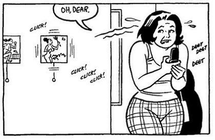
"The Love Bunglers" itself is just stunning, though, the work of an artist who really knows and loves his characters and their long, tangled histories. The final act of this story is jaw-dropping in its audacity, and the last ten pages whip by in a rollercoaster of conflicting emotions. Jaime's craft is absolutely assured. At one point, Maggie and Ray, across town from one another, hanging up their phones after yet another inconclusive conversation, face one another in separate panels, then get up out of bed and kick into motion. They seem to be heading towards one another, each tier of panels mirroring their actions so that they seem to be on a collision course — a course that's suddenly, shockingly altered in the next few pages. Equally effective is the two-page spread in which Jaime, drawing on the history of these characters, depicts them in panels that gradually age them from their earliest appearances up to the present.

By the end, "The Love Bunglers" has checked in with many of the important characters and unresolved relationships from this saga, and hurtles forward to a moving and startling conclusion that would satisfy anyone who's followed and loved these characters. The final pages of this book literally gave me chills: as I read the last page (which I won't spoil, of course) I felt a chill pass up through my body from the tips of my toes to my head, like a bolt of electricity passing through me as tears welled in my eyes. I can't think of any other work of fiction that has affected and stunned and charmed me like Jaime's Hoppers epic has. This latest installment is a new apex for his work, an overwhelming catharsis that, if it is not quite the ending, at least feels like one possible (and very satisfying) ending.

Monday, September 26, 2011

Weekly Comics: September 21, 2011


The Boys: Butcher Baker Candlestickmaker #3 (Dynamite) - I'm usually very down on the idea of "guilty pleasures" — if I like something, I like it, so why feel guilty? For some reason Garth Ennis' The Boys has always seemed like an exception to that rule, because it's pretty much the definition of a guilty pleasure: dumb, violent, the extreme incarnation of Ennis' adolescent desire to shock and disturb readers. The series is often just a parade of typical Ennis tropes: deviant sex, swearing, drinking, lots of blood and violence, all of it delivered with a mix of gleeful exhibition and hypocritical moral scolding. So why am I still reading it? I guess it's just that Ennis, whatever else he is, is a great entertainer, and this ridiculous, blood-splattered series remains big dumb fun, month after month. This spin-off miniseries, on the other hand, is a more restrained affair, focusing on the origin of main character Butcher, providing an explanation for how he became the psychopathic killer that he is. This issue is entirely about Butcher's affair with a beautiful redhead, and in typical Ennis fashion it's broadly, exaggeratedly sweet and innocent and happy. So of course next issue I'm sure the girl's going to be dismembered in some outrageously horrible manner and Butcher will go crazy thirsting for revenge. That's Ennis' familiar pattern, and it's wearing a little thin in this series while he pretends he can tell a serious story in the midst of this thinly disguised excuse for creative cursing and disemboweling. Plus, artist Darick Robertson, whose blocky, somewhat ugly figures are usually so perfectly suited to Ennis' broadly satirical tone and blunt action, doesn't fit as well with this issue's upbeat romance.

Daredevil #4 (Marvel) - So this new series is really awesome. I've read the previous acclaimed takes on this character by writers like Frank Miller, Brian Michael Bendis and Ed Brubaker, and what they all have in common is that they're extraordinarily dark and bleak, pushing Matt Murdock to the limits of physical, psychological and emotional endurance. Mark Waid's new run doesn't ignore that brutal history, but in terms of tone and style this is a fresh, self-consciously distinct approach to the character. Waid's style is light and witty, and his Matt Murdock is a man who's been through every possible kind of hell and come out the other side convinced both that he can handle anything and that he should appreciate anything he still has left. There's a hint of the manic in this Murdock that suggests that the darkness could yet return, but this is so far a refreshingly light-footed and charming book. The art, whether it's by Marcos Martin as in this issue or Paolo Rivera in previous ones, is just as lively and visually inventive, particularly in devising clever ways to visualize the way the blind Daredevil "sees" the world.

This issue starts with two simple, visually elegant pages that immediately demonstrate Martin's graphic acumen: panels of black shadows on a blue background alternate in a grid with black text panels, slowly dealing out minimal visual and aural information about the trouble soon to erupt for Daredevil. It's a stark and effective intro. Otherwise, this isn't quite as exhilarating as the previous three issues of the series, mainly because there isn't the punchy hook of each previous issue: the bounding enthusiasm of Daredevil at a mob wedding in #1, the clever weapon-switching battle with Captain America in #2, the visualization of sound in #3. This, on the other hand, has a lot of nice little moments and provides a sense of what amounts to mundane life for a guy like Daredevil. Martin's art is agile and fluid, a perfect fit for an acrobatic crimefighter like this, and there are plenty of subtle touches to admire, like Daredevil's satisfied smirk as he glides along a high wire towards a pair of machine-gun-wielding crooks. Colorful, exciting and fun, Waid's Daredevil is a great new series.

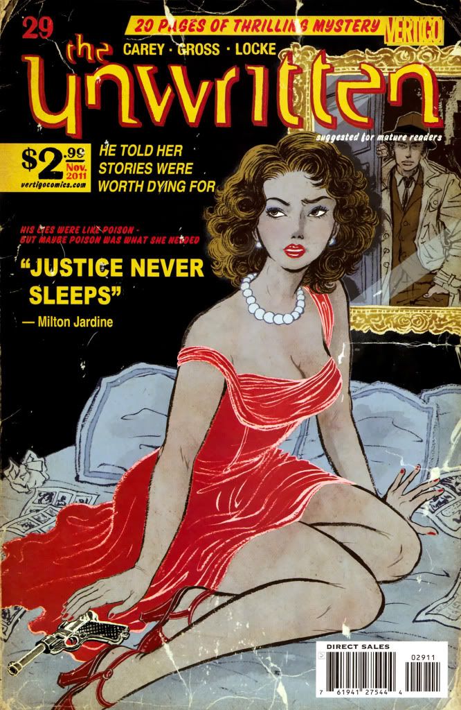
The Unwritten #29 (Vertigo) - This series has a great premise: Tom Taylor's father was the writer of a series of Harry Potter-like magic novels, in which a boy very like Tom himself is the hero. Now that Tom's father is gone, he finds that he actually has the magical powers of his fictional alter ego, and is set against a secretive cabal that seeks to control and manipulate the power of stories. Writer Mike Carey is exploring territory very similar to the "all stories are true" themes often mined by Neil Gaiman and Alan Moore, but The Unwritten has enough of a unique slant on these ideas to feel fairly fresh. This issue continues the current storyline in which Tom probes into the early years of his father, who once worked for the secret organization that Tom now opposes. Not much happens in concrete terms, but the themes set up by the earlier issues of this arc are fleshed out as Tom learns about the tragic conclusion of a story involving a woman who wrote a superhero comic. There are obvious parallels here to the early years of Siegel and Shuster's Superman. This is a satirical stab at the dismal treatment of comics creators by the big comics companies, as well as criticizing the marginalization of women in the field. Peter Gross' art is clean and crisp, as usual; his minimal style isn't always well-suited to this comic's more magical and fanciful sequences, but he captures the more grounded scenes very well indeed. There's little enough magic in this issue, but one panel is especially striking: as Tom travels into the past via his father's diary, a series of overlapping pencil drawings depict Tom sequentially transitioning from his "real" self to the cartoony, simplified figure of his fictional counterpart from his father's novels. The flashbacks to the 1930s in this issue are inked by Vince Locke, who provides more of a scratchy, grimy look to set off these scenes from the more solid, clearly defined present. In its quiet way, this is a visually very striking issue.

Special mention should also be made of Yuko Shimizu, who has done the covers for all 29 issues of The Unwritten so far. Shimizu's covers are always gorgeous, but he's outdone himself here. This is his best work yet, in a run where he's consistently overshadowed what Gross is doing inside each issue. This cover's tribute to pulp novels and old comic books perfectly captures the spirit of the era that Carey is exploring here. This is amazing, and as always I just wish that Shimizu would or could draw the entire issue, to bring this level of artistry and imagination and glistening, unreal color to the interiors of the book.

Wednesday, September 21, 2011

DC's New 52, Week 3 (September 21, 2011)


The third week of DC's New 52 is here now, with 12 first issues released this week. This was a pretty fun week, with a couple of titles I had low expectations for that actually surprised me. The first two weeks were largely predictable in terms of what I figured I'd like and what I guessed I wouldn't, so it was nice to get a few fun curveballs this time around.

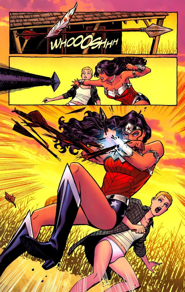
1. Wonder Woman #1 - This was the book I was most looking forward to this week, and it does not disappoint in the least. In fact, if anything it still managed to surprise me with just how great it is. Brian Azzarello brings a gritty, horrific sensibility to this title that at first seems jarring against the bright, bold colors of Wonder Woman but actually makes perfect sense considering all the blood, betrayal and gore involved in the Greek myths that form the foundation for these characters. This first issue dispenses with the exposition-heavy approach of a lot of the other New 52 debuts, and just hurtles into the middle of what looks to be a satisfyingly bloody, imaginative epic. Artist Cliff Chiang has a cartoony, thick-lined style that makes the bloodier moments pop off the page, and there are some really great images and ideas here: best of all the mysterious figure who chops the heads off a pair of horses so that human torsos can grow out of the severed necks, creating a bloodthirsty centaur warriors. Chiang's Diana radiates red-cheeked beauty and purity, a shining icon of strength and goodness, coolly slicing through any obstacles in her way. This is exciting, energetic comics storytelling. Azzarello's writing isn't as pun-filled and pulpy as it can sometimes be, as his excesses wouldn't be a good fit here, but there's still some clever, punchy writing. In particular, there's a thread of clever caption boxes that epitomize the mix of creepy and whimsical that makes this issue so great. One of the most fun and vibrant of the new DC books so far.

2. Batman #1 - Scott Snyder is tackling Batman's name title coming off of a very strong run on the other big Batman book, Detective Comics, just before the reboot. This issue doesn't immediately hit the heights of creepy, suspenseful greatness that that 11-issue run had, but that's because like most of the other New 52 first issues, Snyder is starting slow here, taking his time to introduce the characters. To that end, the issue starts with a brawl that introduces a few heavies from the rogues' gallery, and then has Bruce Wayne attending a party with three generations of Robins in tow, where he meets a few more of Gotham's regular residents. The device that Snyder uses to introduce these characters through captions is a bit clumsy, but probably is necessary considering that the new readers that DC is aiming for here presumably aren't familiar with the fact that there has been more than one Robin, for instance. In any event, Snyder seems to be setting up another grisly mystery, and there's a lot of pleasure to be found in the details — like the fact that the Riddler, glimpsed in the middle of the introductory Arkham Asylum battle, has his hair shaved into a question mark, or the red sneakers that Bruce's son Damien wears with his tuxedo. Greg Capullo's art is quite nice, too, just gritty enough to be a good fit for Snyder's Gotham.

3. Catwoman #1 - If there was any doubt as to what this comic was going to be about from the glossy pin-up cover, the very first panel of the very first page erases that doubt: it's a closeup of Catwoman in a bra, or more accurately a closeup of her chest, since her face is mostly out of frame. And more or less remains that way during the subsequent rushed chase sequence as she puts her costume on halfway, escaping a few steps ahead of some murderous thugs coming to kill her. The pacing and framing is frenetic and suggests the chaotic movement of this ace thief gathering up her few possessions — including a carrier full of entertainingly startled-looking cats — and leaping away from danger. This is a fast-paced, garish, sexy-silly comic propelled by the bold, sexualized art of Guillem March, which has the smutty European vibe of a Milo Manara, with lots of curvy female bodies and cartoony, expressive faces. There's sex, action, blood, and only the briefest interludes for some shreds of character development before a fetishy sex scene between Catwoman and Batman that, amusingly enough, provides the issue's title: "And Most of the Costumes Stay On." It's dumb and regressive as hell, but writer Judd Winick seems to know it and wallow in it, so it winds up being weirdly charming and entertaining and self-aware.

4. Green Lantern Corps #1 - This is some good cosmic fun courtesy of writer Peter Tomasi and the art team of Fernando Pasarin and Scott Hanna. This book is built around two of Earth's Green Lanterns, Guy Gardner and John Stewart, who seem to be having as much of a problem fitting in on Earth as Hal Jordan over in Geoff Johns' main Green Lantern title. Seems to be a theme: it's tough being a Lantern when you're not in space beating up alien bad guys. This first issue establishes a mysterious and apparently very deadly threat — there's some well-done, methodically drawn gore that has a creepy horror-in-space vibe — and then sends Guy and John off to confront it, accompanied by a bunch of generic alien Lanterns. The art is better at cosmic weirdness than humanity or Earthbound drama, but that's fine since the series seems to have quickly left Earth behind anyway. This seems like a solid set-up for some bloody, enthusiastically mindless alien action.

5. Supergirl #1 - As an origin issue where Supergirl crashes to Earth and fights off some armored-up government storm troopers, this issue does a decent job of establishing the character in the midst of an extended fight scene. She's confused by her surroundings and reacts believably to what she only slowly realizes is not a dream, which gives a charge of energy and emotion to what could've been a by-the-numbers origin story. One neat meta touch: when Supergirl's super hearing kicks in, flooding her senses with random snippets of sound, she hears bits of dialogue from some of this week's other DC issues. It helps that it's all attractively drawn by Mahmud Asrar, whose art is kinetic and distinctive, with thick, strong linework. Superman shows up at the very end to tease the next issue, dressed, unfortunately, in his ridiculous-looking, unnecessarily elaborate new costume — if this is the alternative, it's too bad he's not sticking with his jeans-and-t-shirt look from Grant Morrison's Action Comics. This is a basic superhero first issue but it has some promise.

6. Captain Atom #1 - Wow. This comic has a really big disconnect between the quality of the artwork and the quality of everything else. This is one gorgeous-looking book, courtesy of artist Freddie Williams II, though in fact as much if not more credit in this case has to go to colorist Jose Villarrubia, whose bright tones and colored-pencil-like shading define the art style of this issue on equal terms with Williams' linework. This is very striking work: the titular Doc Manhattan-like hero seems to glow and radiate energy, and the high-contrast world around him is shadowy and bold, delineated by huge blocky areas of black that make the glowing blue Captain Atom stand out even more. The problem is that the writing doesn't come anywhere near this level; this isn't as bad as JT Krul's abysmal Green Arrow, but it's still really pedestrian, packed with clunky, overly wordy dialogue and awkward internal monologues. The only thing sillier than the disaster movie conceit of a volcano in Manhattan is the way that Doc, oh sorry Captain Atom actually addresses the volcano like it's a supervillain: "Okay, what do you say, hot magma? How about we cool you off — big time." Not to mention the fact that the book's best aspects, like the identity-blurring nature of the hero's powers, are largely cribbed from Alan Moore's Watchmen. This is certainly a good-looking book. It's just a shame it's not actually a good one.

7. Nightwing #1 - A lot of these New 52 first issues aren't bad so much as standard, and this one is pretty much the definition of that tendency. Dick Grayson's always a decent character, and he's got some new wrinkles now after playing Batman during Grant Morrison's Batman and Robin, but this first issue doesn't add a whole lot to that foundation. Dick fights a couple of boring supervillains and visits the circus he used to belong to before his parents were murdered. There's a bit of a hook in the late-issue line about "the fiercest killer in all of Gotham," which presumably ties in to the revelation on the last page of Scott Snyder's Batman #1, but I'm not sure it's enough to come back. The workmanlike art by Eddy Barrows and JP Mayer is OK, and some of the fight scene splash pages towards the beginning aspire to second-rate JH Williams III, but all in all this issue is just average and uninspiring.

8. Birds of Prey #1 - This one's disposable and almost instantly forgettable, as rather generic heroines Black Canary and Starling square off against a bunch of literally faceless foot soldiers. Writer Duane Swierczynski tries to spice things up by shuffling the narrative chronology, flashing back to earlier scenes to break up what would otherwise be an issue-long fight scene, but there's nothing to these characters and it's all very dull and rote. Likewise, Jesus Saiz's art is competent enough but not exactly exciting, and the colors are alternately washed-out and glossy so that things don't seem to quite fit together as part of a coherent visual world.

9. Blue Beetle #1 - This is another of those undistinguished titles about which there really isn't much to say. It's kind of the Spider-Man template, the high-schooler who suddenly gets great power, but there's not much to make this take on that familiar concept stand out. Other than all the Spanish dialects, I guess, since the characters are mostly Hispanic — which means, of course, that there has to be a gang member with a red headband. Whatever, it's all silly and slight.

10. DC Universe Presents #1 - This title is intended to be a catch-all for various characters who can't sustain their own titles — although considering some of the dodgy, pointless characters that DC did give books to, it's hard to imagine who would meet those requirements. As a matter of fact, at least for this first arc, the book will be about Deadman, who is actually a pretty interesting and unique character. Or he should be, anyway, but this is mostly just dull, despite one nice sequence in which the body-hopping Deadman leaps from one host body to the next trying to speak to an old acquaintance. The upshot of this series is that, with the right characters and the right creative teams, this could be a good vehicle for short stories and standalone arcs that wouldn't sustain an ongoing title. This first arc doesn't look like anything special, though.

11. Legion of Super-Heroes #1 - Oof, this is just lousy. This group of futuristic heroes is connected to the ones unmoored in time in the similarly bad Legion Lost, and this issue suffers the same failings as that one, only magnified. This is a HUGE cast of characters, none of whom I've ever heard of before, and it seems like there's three new characters introduced (with caption boxes listing their names and powers) on every page. It's exhausting, and it makes my eyes just glide off the page when all that seems to be happening is handing out sound bites for twenty or thirty interchangeable aliens. This would be bad no matter what, but it's especially galling since the stated mission of the New 52 is to streamline things and bring in new readers, and I can't think of any other book in this whole relaunch that's less friendly to new readers. Maybe that's unavoidable — it's hard to imagine this nonsense ever being readable, let alone good — but it's still a big failing.

12. Red Hood and the Outlaws #1 - I didn't think it was possible, but this is pretty much as dumb as Hawk and Dove. I don't know much about former Robin Jason Todd's return to life in recent years, but if the character's always been this bad he should've stayed dead. Here he seems to be a low-rent DC version of Deadpool, a mercenary who's constantly cracking wise, making jokes of a staggering level of badness. (I was actually stunned by the corniness of a certain "tanks" pun.) A whole bunch of pages are totally given over to ogling yellow-skinned alien Starfire in a bikini, making much of the fact that she has sex with pretty much anyone who comes into her orbit, which is about the extent of her characterization. And when she's not center-stage, the rest of the issue is spent ignoring the fact that there's been a reboot, choosing instead to refer extensively to the continuity and pasts of these characters in the most ambiguous and confusing way possible. Seriously, the issue ends not with the conventional "to be continued" but "to be explained," which is really not a good sign.