 Batman #2 (DC) - I love how deeply engrained Scott Snyder's Batman is in the history of Gotham City, its legends and the ancestors of the characters who define its present. The opening of this issue, with its emphasis on Wayne Tower, recalls the Snyder-overseen miniseries Gates of Gotham, which explored the secrets behind the construction of that tower. Snyder is signalling that the past is once again going to reach forward into the present. This issue also explores another of Snyder's running themes in his Batman work: the ways in which the city of Gotham shapes those who live in it, and vice versa. His Detective Comics run, with Dick Grayson as Batman, focused on Dick's fears that Gotham would transform him, would unleash the darkness that so often threatens to consume Bruce Wayne. But as in that series, Snyder's new Batman seems to be confirming that things mostly work in the other direction: each man sees his own Gotham, shaped or warped by his own experiences and how he's chosen to react to them.
 Bruce's conversation with would-be politician Lincoln March underlines this theme. March is a man with a past similar to Bruce's, having lost his parents at a very young age; his story about his mother's heart pin is an eerie echo of Bruce's fixation on his own mother's pearls. March says that Gotham itself helped him past his trauma, giving him a sense of purpose, and in a strange way this is also true for Bruce, though not in the same sense as March's idealistic political fervor. Both men see themselves as shaped by the city, changed by their traumatic pasts, but they take very different trajectories and see Gotham in very different ways. It's great how Snyder is weaving these undercurrents into his story from the very beginning, slowly developing these themes as Bruce, confident in his knowledge of Gotham and of his own relationship with the city, prepares to face yet another threat from the city's past, a threat to the city that he sees as integral to his identity as Batman. Snyder's storytelling is patient, obviously working towards a bigger arc, but not at all decompressed — this issue is well-paced with action, some displays of Batman CSI tech and detective work, and the moments that develop Snyder's big picture themes.
The Boys: Butcher Baker Candlestickmaker #4 (Dynamite) - Well, I called what was going to happen in this issue. Not that it was hard to predict. The problem with this miniseries is that it was always so obvious just where it was going to be heading, the only place it possibly could be heading. It's a familiar Garth Ennis formula, especially in this series, which revels in brutality and horrible things happening to decent people. So when the future leader of the Boys, Billy Butcher, met a beautiful redhead and married her, the only question was in what horrible and grotesque way the Homelander was going to kill her so that Butcher could be pushed onto the unceasing quest for vengeance that drives him over in the main series. That question has now been answered, and the final pages of this book, as drawn by Darick Robertson, are appropriately harrowing and horrifying — suffice it to say that Ennis' warped imagination has concocted some really nasty images here, images that owe a bit to Alan Moore's Miracleman and offer up a grisly, cynical twist on one of the pivotal events of that series. But there are no surprises here, and there's no real depth to Ennis' revelation of Butcher's back story. It was always obvious from the main series that superheroes — and specifically the Homelander — had been responsible for something awful in Butcher's past, that they'd probably killed someone he loved. Now that the details have been revealed, it doesn't really change his character very much, or reveal much about him that wasn't already apparent. It's just another opportunity for Ennis to wallow in the terrible things that superpowered beings do in this series, another opportunity to show that people with real power almost invariably use it to hurt, use and screw over others. The political applications of that idea are made especially clear in this issue's discussions about Thatcherite England, but even so this whole miniseries just feels so redunant and unnecessary.
Captain Atom #2 (DC) - This is just a really cool-looking terrible comic. The linework of penciller Freddie Williams II isn't anything special; it's mostly pretty minimal and crude, and when it isn't there are some ugly, distorted faces on the pages where Williams lays down the ink thicker. Colorist Jose Villarrubia does most of the heavy lifting here, giving the series' title character a pale blue sheen that makes him stand out boldly from the world around him. It's very striking, especially on the pages where the atomic hero is overwhelmed by the electronic signals of the Internet and text messages flowing through the air around him, spectral information as ghostly and colorful as the hero himself. If only it were a good comic with this kind of distinctive style, but JT Krul's writing and plotting are just boring — when they're not outright silly, as in the volcano that abruptly popped up in the middle of New York at the end of last issue, a threat that Captain Atom seems to have neutralized between issues, leaving the volcano inert but still sticking out of a Manhattan street. I wish this comic was good, because I do like looking at it, but unfortunately it has little to offer beyond its admittedly pretty colors.
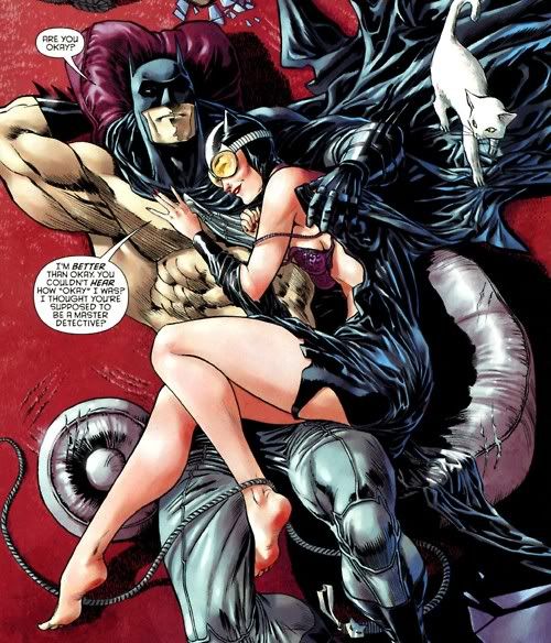
Catwoman #2 (DC) - I've gotta give it to Judd Winick: he pissed off a whole lot of people by ending the gloriously sleazy first issue of this comic with a fetishy, campy Batman/Catwoman sex scene that apparently offended everyone but me. (That's an exaggeration, but not by much.) And instead of moving on from there, he decides to open the second issue with the sex scene still in progress, giving us not only a splash page of a post-coital smiling couple but a panel of Batman adjusting his belt as he pulls his costume back into order. Never thought I'd see that. And I have to say, I'm still digging this ridiculous comic. Guillem March draws a very sexy, curvy Catwoman whose face expressively projects her playful delight in manipulating her opponents. She'll get her revenge for some dark things from her past, and she'll have a lot of fun doing it. The end of the comic goes very dark, very suddenly, but before that it's just so much fun to see Catwoman flirting with Bruce Wayne, unaware of who he is but feeling a strange attraction to him anyway, and then cleverly manipulating some rival mobsters into a shootout to get her revenge. This is pulpy stuff that very deliberately leaps across the line separating good taste from bad, and I can't help but admire it for that. It's trashy, and Winick and March undoubtedly know it, and the result is kind of a grindhouse Catwoman comic, delving into extremes of flashy sexploitation and over-the-top violence. I'm sure this comic will continue pissing people off, and I'm equally sure that it's going to be hard to look away from its garish trainwreck wildness for as long as it continues in this vein.
Green Lantern Corps #2 (DC) - After the first issue of this series, I thought I was onboard for what seemed like it was going to be some mindless cosmic action. Now I'm starting to think it's a bit too mindless after all. Not much has changed from the first issue, I admit, except that now the focus is irrevocably off characterization, so that Lanterns John Stewart, Guy Gardner and the squad of alien Lanterns they lead are all pretty generic. At least the first issue gave some character beats to the two human members of the team. The threat they're facing, which was just an unseen terror killing Lanterns last issue, has now been revealed as a bunch of generic guys in black armor, so that's a letdown too. Basically, it feels like this isn't going to be the great action series I was hoping for, and the alien Lanterns are going to continue to be mere fodder for limb-hacking and grisly deaths, and I'm not sure that there's any reason to keep reading.
Journey Into Mystery #629 (Marvel) - Since it seems like Marvel's Fear Itself event is quite simply never going to end, I guess this potentially enjoyable book is going to remain trapped in a crossover swamp for the forseeable future. Kieron Gillen's writing is a weird mix of formal prose and flippantly delivered dialogue, with the latter being much more palatable than Gillen's attempts at Asgardian portent. As usual, Loki's breezy manner is the main appeal of this comic and this character. His delivery of tossed-off battle orders — "Dark Asgard flies on engines powered by raw fear-stuff and similar... let's blow them up" — suggests his childlike enthusiasm and casual approach to prophecy and war. This is contrasted against the stiff, often awkward writing of the narrative caption boxes, which overpower the much more lively dialogue. But the real problem continues to be that Journey Into Mystery so far has just been a peripheral part of Fear Itself when it should be a fun, slightly goofy book about the adventures of kid Loki. It's a waste of this character that his showcase comic mainly summarizes events in other series (apparently Thor's dead over in Fear Itself — yeah, that'll last) and adds a little ancillary action.
Justice League #2 (DC) - Geoff Johns' flagship DC book continues to move at a deliberate pace, slowly introducing the major players and having them size each other up with pattering dialogue and the obligatory superhero-misunderstanding-fight-scenes. Last issue focused on Green Lantern and Batman, with Superman showing up at the very end, while this issue throws the Flash into the mix and moves forward with the origin of Cyborg. Johns' punchy dialogue prevents the decompressed pace from being frustrating, and it helps that it's inherently fun to see these famous heroes meeting each other for the first time, cracking jokes as they try to figure out the origin of the mother boxes that Darkseid is planting in various US cities. Jim Lee's bold art is another pleasure here, and he's at his best in depicting a fight scene between Superman and the Flash, with the speedster dancing in circles around the Kryptonian before Superman finally catches him and sends him flying with a playful flick of his finger. The layouts of fight scenes like this are simple and elegant, breaking down the action into small gestures that lead into the massive, explosive pin-up panels that are Lee's forte. When he tries for a more complex layout, as he does on a page where Green Lantern calls the Flash for help, the page starts to look crowded and cluttered, with word balloons and layered panels creating visual confusion. That's just one page, though, and the rest of the issue tends to play to Lee's strengths much more clearly, with simple, iconic depictions of fight scenes and superhero posing. The introduction of more heroes in this issue gives the impression that things are speeding up and spreading out, gathering momentum as the Justice League of the title begins to take shape. When Wonder Woman and, presumably, Aquaman show up next issue, the pacing should get even more frenetic, the action more frenzied.
Nightwing #2 (DC) - I like Dick Grayson as a character, especially since his recent stint as Batman, but I have to say, the prospect of "Nightwing solves a circus mystery" as the driving plot of this first arc is really not exciting me on any level. The same thing goes for the assassin who's stalking Dick, a generic costumed guy with claws called Saiko, which not only provides the awful pun of the cover text but allows Dick to make a similarly terrible sorta-pun inside the actual comic. This just isn't really that interesting, from the generic love interest to the weirdness of Dick inheriting a circus to the off-kilter pacing. Eddy Barrows' fight scenes are interestingly laid out — as in the first issue, he seems to be taking more than a few page design cues from JH Williams III — but his faces are really goofy looking, and the presence of two inkers suggests that this is yet another New 52 issue affected by deadline pressure.
Supergirl #2 (DC) - The very decompressed storytelling in this series is already starting to get annoying. The first issue was basically just an extended fight scene between Kara and a bunch of armored soldiers as she tries to figure out what's going on. The second issue is... basically just an extended fight between Kara and Superman as she tries to figure out what's going on. While I enjoyed the first issue well enough, Michael Green and Mike Johnson are certainly taking their time building up to anything more substantial. Here, the two Kryptonians duke it out because Kara refuses to believe that Superman is actually her cousin, mainly because in her memory he's still a baby, which raises questions about where (and when) she's actually from and how she got here. But the whole thing feels contrived because after brawling all issue, Kara abruptly decides to stop by the end, and suddenly trusts her cousin after refusing to listen to him at first. This series needs to quickly do something besides staging 20-page fight scenes, even though Mahmud Asrar is undeniably good at drawing them: his figures in motion have a nice sense of energy, and he's great at depicting the paths of destruction that the hurtling superbeings leave in their wake.
Wolverine #17 (Marvel) - Jason Aaron has been doing some fine work on Wolverine lately, quite literally sending the man with the claws to hell and bringing him back only to tear him down even further. Then, just last issue, Aaron offered up a surprisingly touching and even funny reminder that Wolverine stories can and should be about more than just suffering and killing. This issue picks up that thread and serves as a placeholder in the aftermath of Aaron's Schism miniseries, which somewhat artificially concocted an excuse for Wolverine and Cyclops to fight and split up the X-Men into two teams. Now Wolverine's preparing to restart the Xavier school, so this issue is pretty much just filler before that storyline starts in earnest over in Aaron's new Wolverine and the X-Men series. As filler, it's not bad, and Aaron's feel for humorous dialogue is especially sharp here, as Wolverine goes hunting through San Francisco's Chinatown underworld for some drug dealers who have managed to subjugate a pair of dragons. Yes, really. It's knowingly a bit goofy, especially when Wolverine's throwdown with Gorilla Man is interrupted by the meta commentary of a pair of onlookers whose banter reflects the stupidity of the superhero comic convention that every time two heroes meet, they must fight. Considering all the angst and poignancy of Aaron's recent Wolverine arcs, this kind of low-key, light-hearted issue was probably needed to provide a breather before the aftermath of Schism really starts to play out.
Wonder Woman #2 (DC) - Damn I love this comic. This issue isn't as rapidly paced as the action-packed first one, but it has the same energy and vitality. Brian Azzarello's writing is crisp and efficient: he tells Diana's origin story in just two pages and caps it off with a casually jokey exchange. He packs a lot into this issue, as Wonder Woman takes Zola — the woman carrying Zeus' latest bastard child — back to the Amazons' home. Azzarello's dialogue is crackling and sharp, very different from his usual hardboiled style but with his characteristic wit intact. Zola's conversation with Hermes is great, as she wonders which of the men she's slept with lately could have been Zeus in disguise. It's not only funny but sex-positive and non-judgmental, especially remarkable considering some of the depictions of women in other New 52 series. It helps that Cliff Chiang's cartoony, expressive faces give his characters, particularly all the women in this story, vibrant personalities. The design of the villainous Strife, Hera's daughter and apparently Diana's sister, is especially effective, appearing as a willowy, pale blue gothy figure in a shredded cocktail dress.
I really love Supergirl's glacial pacing. If they can keep anything meaningful from happening for another half dozen issues or so, it's a classic. (Somehow the artwork seemed a bit weaker this month, though I can't put my finger on how that is. A little too sharp in the fuzzy areas, something like that.)
ReplyDeleteOn the other hand, I won't be following Batman anymore because it has too much story for me, too many characters, ages of backstory, one probably has to read this thing with a family tree by the side like them fat old russian history novels. Also the art gets on my nerves, March and Bruce (?) look so similar to me, even in posture, that I can't accept them as two different persons.
Btw, been following some of your recs here and elsewhere, and have hugely enjoyed Sleeper, best sustained storytelling I've encountered on my recent comic binge so far. Thanks.
I think that Greg Capullo's art in Batman is just OK, and I agree that he's not great at differentiating characters. There's a panel in issue #1 with Bruce and his three Robins where all 4 men pretty much look the same. And so does Lincoln March. You can tell them apart mainly by height and level of bulk. So I'd like the book more with another artist, I think, but I still just really enjoy what Snyder is doing here and the story he's telling. He's a great plotter. I don't think it's that complex or overwhelming, either. I'd say if you read Gates of Gotham (a miniseries he co-wrote) you'd have the necessary back story for this trip into Gotham's past.
ReplyDeleteI'm glad you liked Sleeper, that's one of my favorites too. The character of Miss Misery is one of the best uses of superpowers to inform characterization that I can think of. I'll read anything that the Ed Brubaker/Sean Phillips art team comes up with; their noir series Criminal is another brilliant work.
I agree with Lutz about the difficulty of telling characters apart in Batman - Bruce and March do look almost identical. I was wondering if there was a purpose to it, that maybe they were making some kind of parallel between them, but it sounds like maybe Capullo just has one face. :) I do like the storytelling a lot, though, so I'm definitely sticking with it.
ReplyDeleteOn the other hand, I also really like the slow pace of Supergirl. I hadn't even thought of it being slow until now - I picked up both issues last week and enjoyed them a LOT. I don't know a lot about Superman's back story or Krypton, so seeing some of that is kind of fascinating me, plus seeing the two of them beat each other up is pretty entertaining.
I'd avoided Justice League at first, not thinking I'd care too much for seeing the whole group do stuff together, but I picked it up on a whim and LOVED the interactions between the characters. It was a lot more fun and breezy than I expected. I don't love the Wonder Woman solo comic as much as you do, but I'm still intrigued enough to keep reading. But I don't understand at all how she fits in with the same universe as Justice League. All the mythology stuff seems really foreign. Do they just ignore that in the Justice League arcs? I guess I'll find out next week.
I asked the internet re the Supergirl style changes and found this from Mahmud Asrar: "DC wanted me to do this with my marker style, which I use on private illustrations and commissions. I was encouraged to use that style even though I was slightly anxious about it as I have not used that type of rendering for a page before. I started out with the covers and it worked. Then gave a shot to the pages and it turned out nicely. In fact I am so happy about it as I am almost in complete control of how the page looks like from start to finish. The process is much more enjoyable as it’s more like actual painting than just slaving on autopilot with pencils ... However, the schedule on first issues was pretty tight so we opted to get Dan Green and Bill Reinhold on board for inks. The first few pages of the first issue are done in this style and I’ll be returning to it fully on issue 4.
ReplyDeleteRe: Criminal, I've thumbed through a couple of issues but couldn't get interested. Probably because they're so full of movie tropes and I want Brubaker and Phillips to do superpowers instead. Also love Incognito, which has all the same faces, but much more punch (and some brilliant coloring as an extra).
Jandy, while I think Snyder definitely was drawing a parallel between Bruce and March, it's also true that Capullo basically seems to draw everyone looking the same, so I don't think the art is part of that parallel. Like you, I'm in it for the story and I'm pretty indifferent to the art. Snyder had a great art team on his Detective Comics run, it's a shame he couldn't bring them back from more here.
ReplyDeleteI like Justice League too, it's a lot of fun. Like you say, the character interactions are really well-done. Wonder Woman should fit in just fine. I'm sure the mythology stuff will just be more peripheral in that book than in her solo book. After all, both Marvel and DC have a long tradition of slotting various mythological characters (Greek, Norse, etc.) into their superhero universes. These comics tend to treat Greek or Norse gods and all that on the same level as Kryptonian aliens and stuff like that.
Lutz, thanks for the quotes from Asrar. I definitely love the art in Supergirl, even if the book as a whole isn't quite doing it for me.