Ssso while my interest in Animal Man is being consumed by The Rot ... really I don't get why they would make a "character" out of that anyway. The Annual even took great pains to explain that The Rot itself wasn't interestingly evil at all, just things in normal life that had become a little unbalanced. What is The Rot, what does it signify? Auto-destructive Unamericanism which you have to flee in a trailer from? Seems like poor Rot has come under the influence of these foreign agentssss with the funny accentsss ... I think I'd prefer if DC had reshuffled Ann Nocenti to write this title instead of her goofy (though somewhat enjoyable) Green Arrow revamp, and we'd at least have some sensible environmental issues ...
Well, so while my interest in Animal Man has gone to waste, I did take a curious look at how its former artist Travel Foreman would fare with his new title, Birds of Prey. The very first impression is that for a writer who needed something easier on the nerves due to personal hard times it looks like a frying pan into the fire situation, because the carnage here grabs immediate emotional hold, with this tableau inspired by photos of real people having died horribly during the Civil War:

But that's just the wake-up call and from then on the body count is restricted to people who are already dead. Anyway the art is spectacular. Inks are handled by Jeff Huet (who had inked Foreman on AM sometimes), which makes the black patches that cross faces somewhat lighter, and the moves somewhat easier, though the uncertainty of anatomy becomes a little riskier through his services. The heavy foreshortening, often strengthened by hatchings or straight lines that follow the ground, the flat geometrical architecture, clean-surfaced and empty, together with wonderful colors by one Gabe Eltaeb, which in their lightlessness look like they've turned stale through chemical reaction, combine to a sort of early renaissance mood. A beach party in this world would be like this here Masaccio.

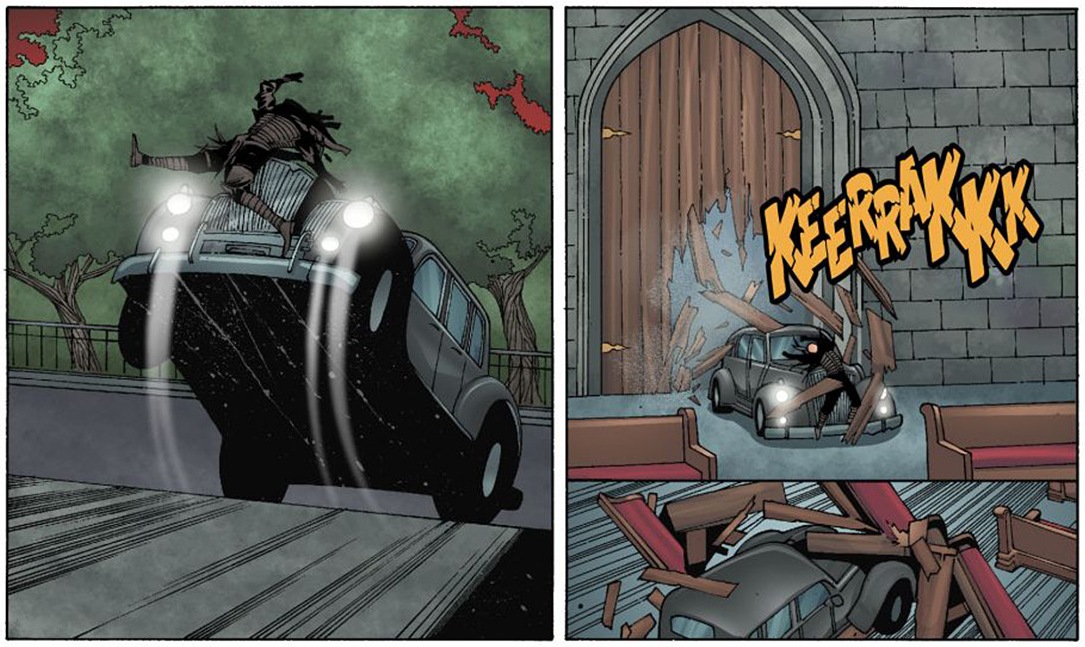
Upstream I've lamented the strange computer-rendering of a house or a car in Animal Man, how utterly incompatible they seemed to the very expressive linework, but here I love these contradictions. Pictorial space seems digitally collaged together, it's structured in askew layers which despite the steep foreshortening make no sense at all, which funnily seems to give it a sort of old-school quality. Movements are frozen or expressed by lines which would usually define surface. See this panel with the car an absolutely solid, unmovable object yanked from a standstill to a rampant posture by the glare of its headlights, while the concrete surface we stand upon comes crashing toward us like a waterfall. Similarly, on the lower right, the floor is pulling itself from under the pews ...
The story? I don't know, pleasant enough. Probably some cheesecake would have served it better. The jokes merely disrupt the mood and, though the issue is mostly composed of action and bonding rituals between the women, there hovers an air of indecision about them, of pauses that correspond to the empty digital spaces. Here's an interesting panel after the deed, the composition centering on the lid of the freight car that has just been closed to contain the threat, while the heroines linger each alone with their blues, two with even their heads cut off by the image frame.

So while I don't suppose it's a good comic by any proper standards, I'm really looking forward to how the series will continue ...
